If your Mission Statement is your compass for your business decisions, a mood board is our compass for aesthetic decisions.
There is so much amazing content in the world today. From Instagram to Pinterest to design journals, our resources for inspiration are unending. So shouldn’t it be easier than ever to decide on an aesthetic direction for a brand or other project?
Not really.
We have so many great choices for color, typography, printing, imagery, etc. that sometimes it can be hard to know where to start. Choosing between two beautifully made typefaces is harder than choosing between tacos and pizza (trust us because this dilemma causes a lot of delayed lunches at the studio), and the consequences of making the wrong choice are a lot worse than lunch regret. If only we had a compass to guide us to the right choices!
Oh wait, we do: mood boards!
These choices may seem small or insignificant, but they’re all vital components of a successful design. We talk more here about how color, typography, and more effect a brand’s success in relating to its target market.
On top of the challenging choices we have to make, we are also tasked with coming up with something original. This would be quite a challenge without our design process, including creating mood boards.
The journey to a beautiful brand.
Our design process is set up to help mitigate the indecisive paralysis that can overwhelm a designer when they’re staring at a blank screen. It’s like our trail map! It outlines every stop along the route and keeps us headed in the right direction. Mood boards are a very important stop that helps guarantee we get where we need to be.
Prior to taking a trip, you might look into the place you’re going and then pack your bag with necessary supplies. That’s what we do before we start a project. We spend some time educating ourselves on the industry and competitors to see what’s already out there, what the target market is expecting, and what differentiates our client from their competitors.
While we’re researching, we gather images of competitor websites, marketing materials, branding, etc.
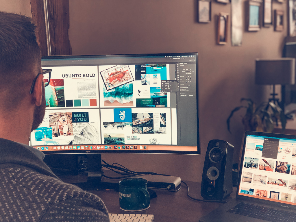
Once we’ve developed a solid understanding of the client, the target market, and the competition, we start working on the aesthetic direction. We compile images including photos, magazine clippings, graphics, textures, color — really anything that helps us define the “look” of the project. After we’ve scoured the internet for the best inspiration that fits with the research we’ve done, we start sorting.
Decisive Aesthetic Direction
Usually, a clear direction emerges when we sort through our inspiration. Commonalities in color, type treatment, imagery and more help us visually define the qualities we spent time researching and translate them into a “mood.”
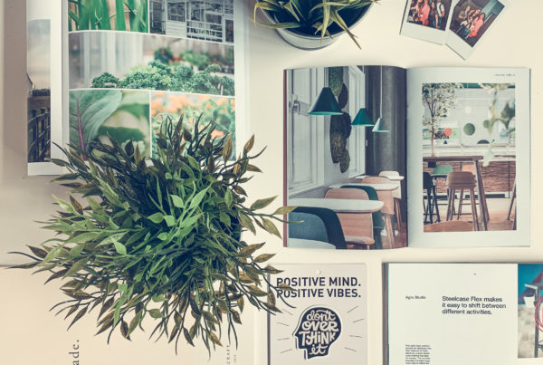
The mood could be described with words like “friendly,” “confident,” “reliable,” “unique,” etc. and is presented on a “Mood Board.” Here are some examples of mood boards we’ve created:


Each board portrays the mood of the brand and is a compass for us when we’re navigating those challenging decisions. If the mood board is successful, we can seamlessly move into the design stage of the process. We have narrowed down our choices by defining what will actually communicate the right things to the target market.