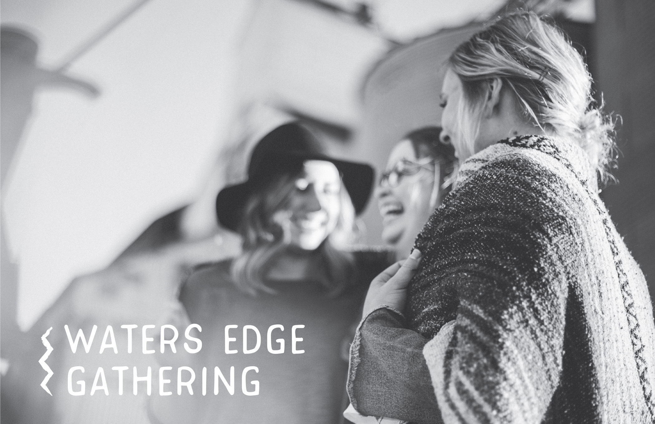
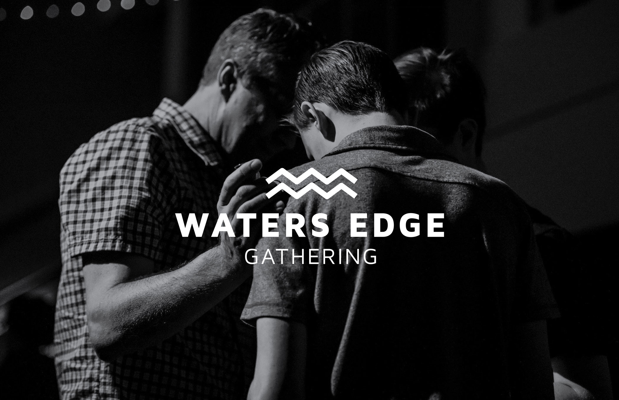
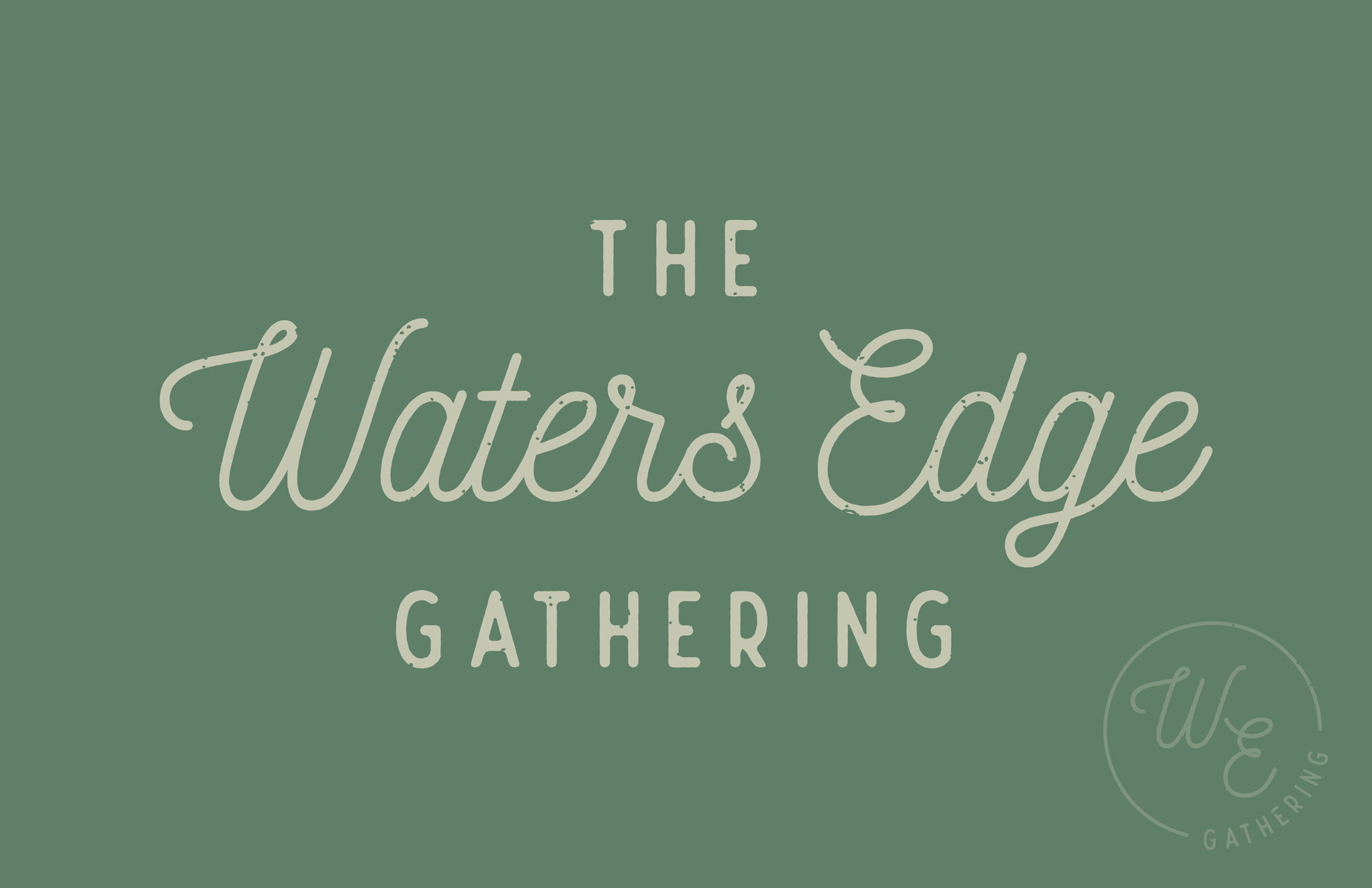
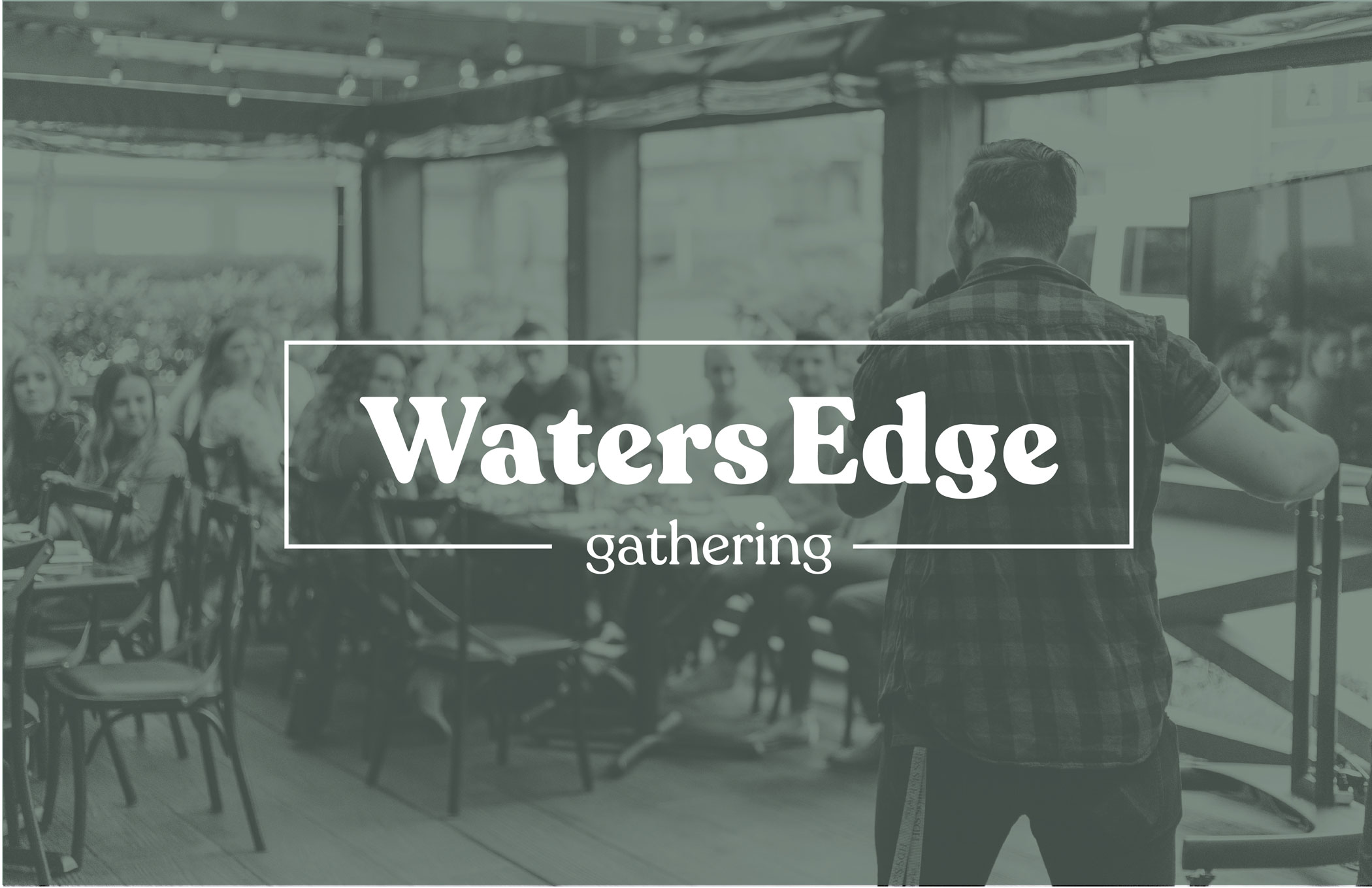
Water’s Edge Gathering is not a church. Well, it doesn’t seem like one. WE is a new type of gathering place that invites everyone — no matter where they are on their personal religious journeys — to come and talk about what they believe and ask their questions. Their goal is to show what a modern, young, group of believers can be. Oh, and did we mention it takes place at a brewery? We loved learning about their mission and helping them create a brand that conveys who they are — inclusive, progressive, and open.
Water's Edge Gathering
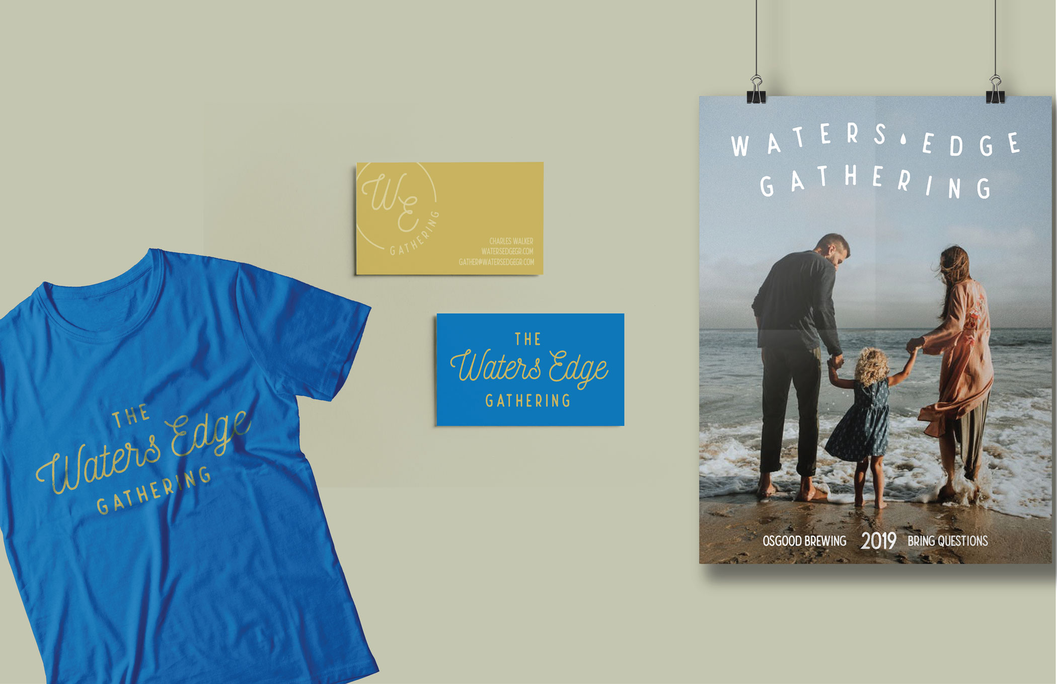
Water's Edge Gathering
Water’s Edge Gathering is not a church. Well, it doesn’t seem like one. WE is a new type of gathering place that invites everyone — no matter where they are on their personal religious journeys — to come and talk about what they believe and ask their questions. Their goal is to show what a modern, young, group of believers can be. Oh, and did we mention it takes place at a brewery? We loved learning about their mission and helping them create a brand that conveys who they are — inclusive, progressive, and open.
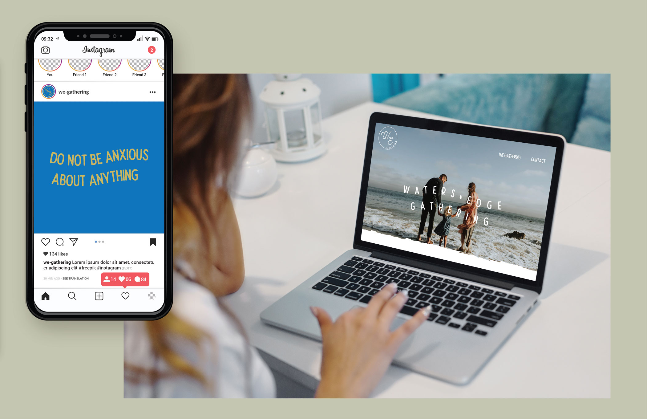
Client
Water’s Edge Gathering
Year
2019
Deliverables
Brand Identity + Messaging
Logo Design
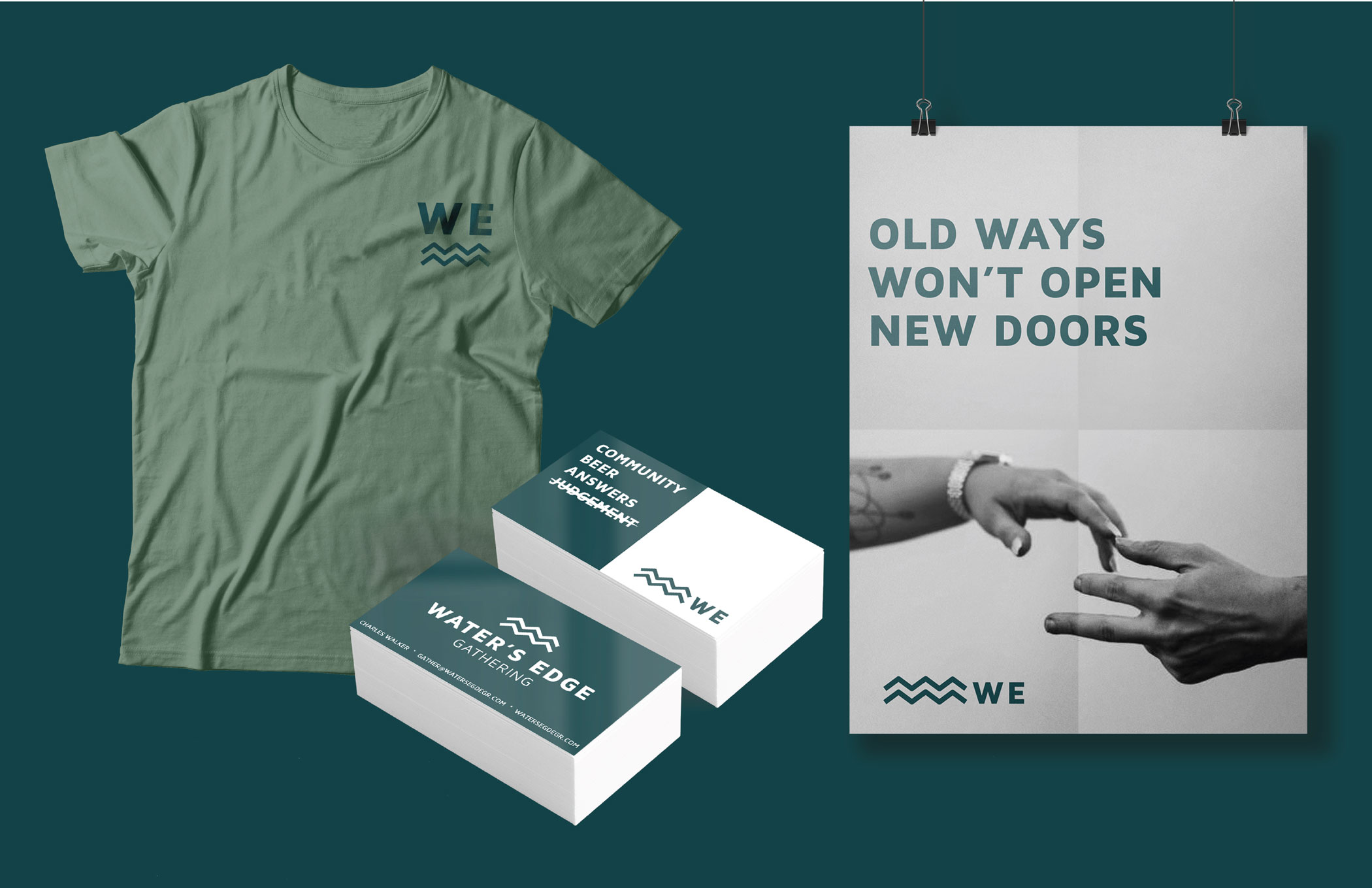
Old ways won’t open new doors.
Water’s Edge Gathering is an open, inclusive community. Their mission is “To be a spiritual community for those living on the edge who are not connected to a church community.”

Branding Process
Mood Boards + Concepts
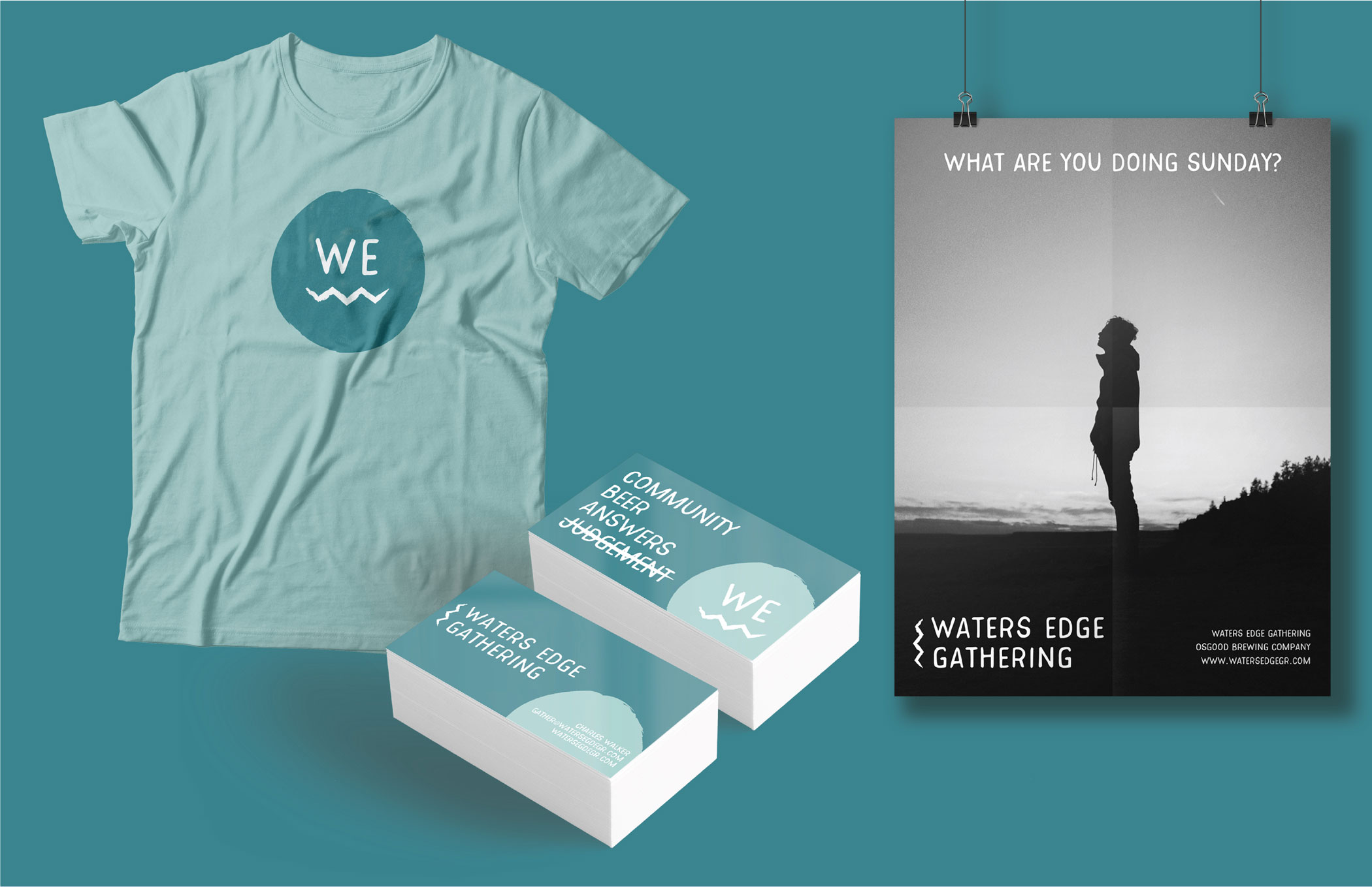
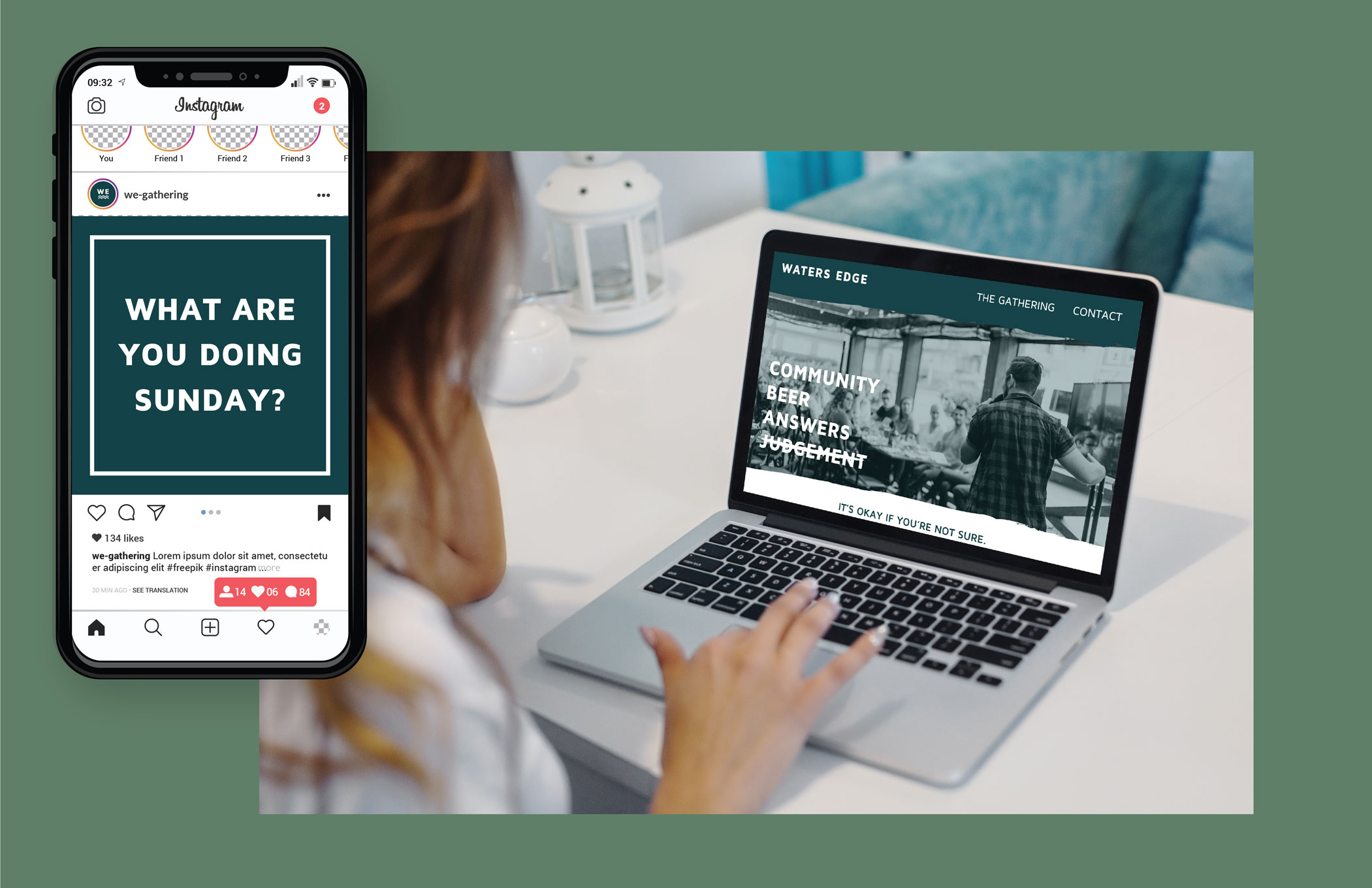
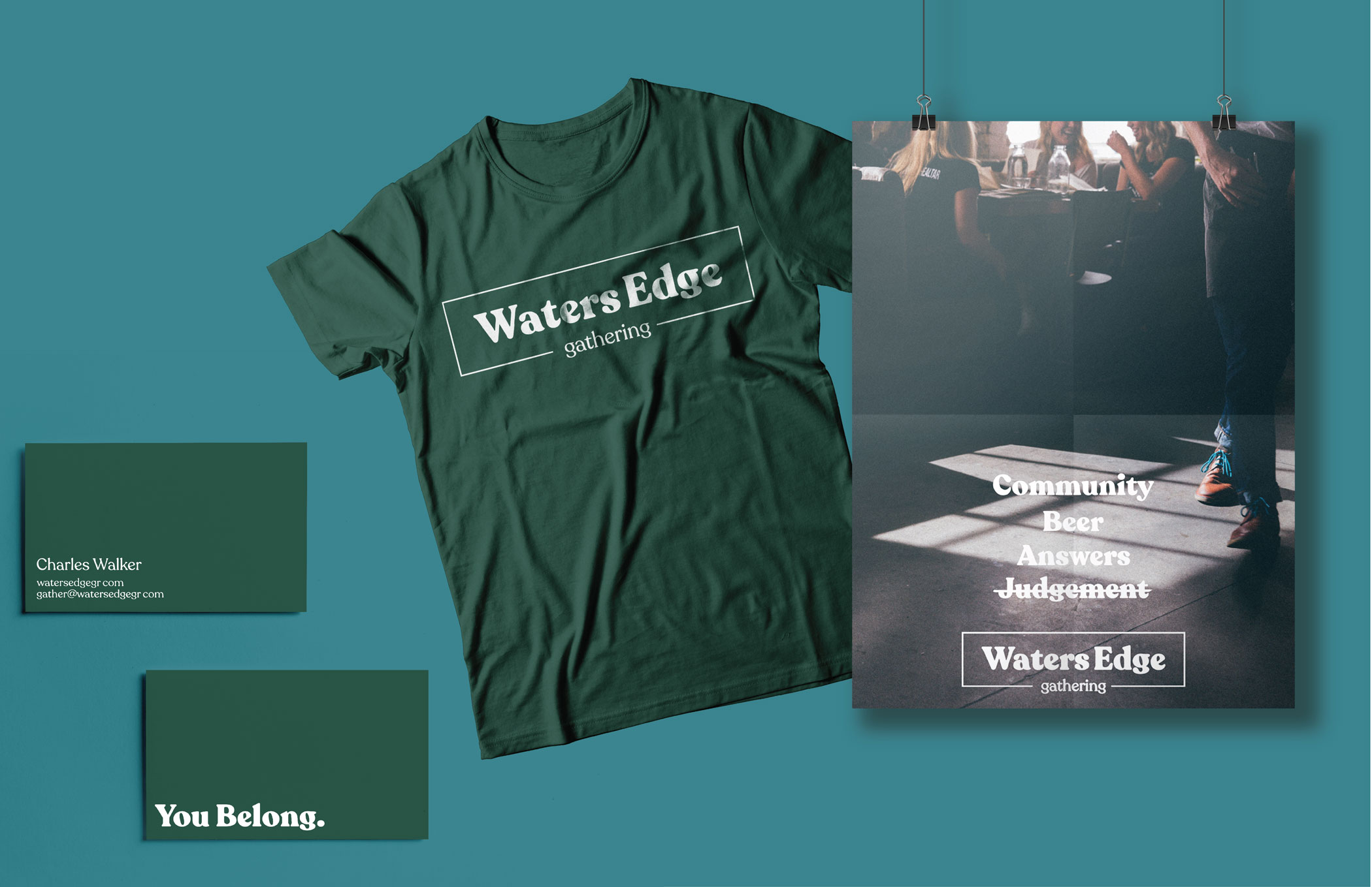
Community. Beer. Answers. Judgement.
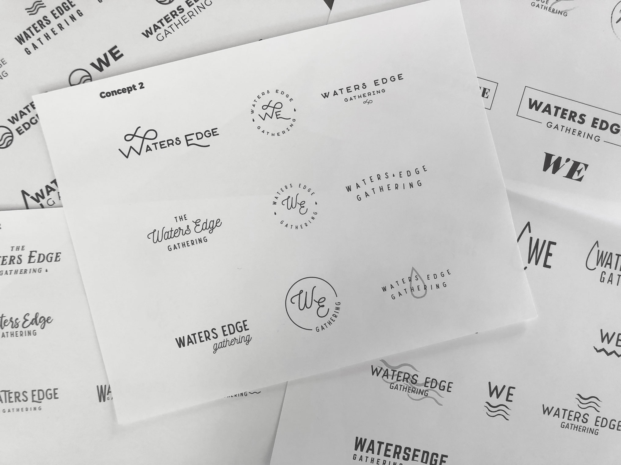
Take a look at our process including some of the concepts that we did not pursue with WE. We are very proud of the concepting that went into delivering the final brand.
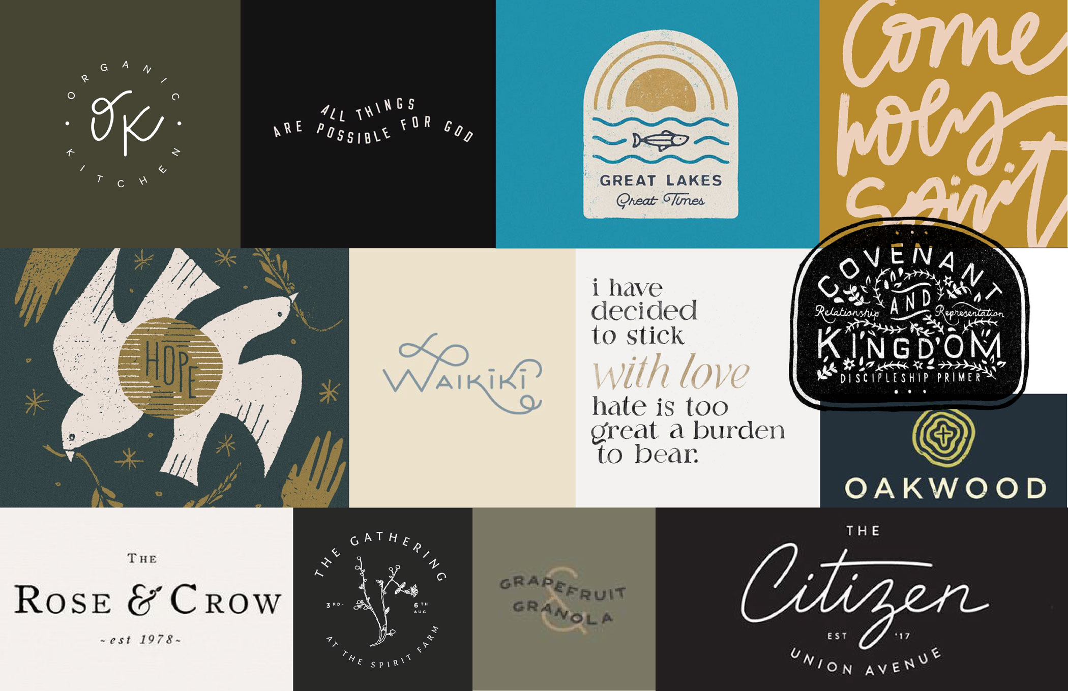
Mood Boards
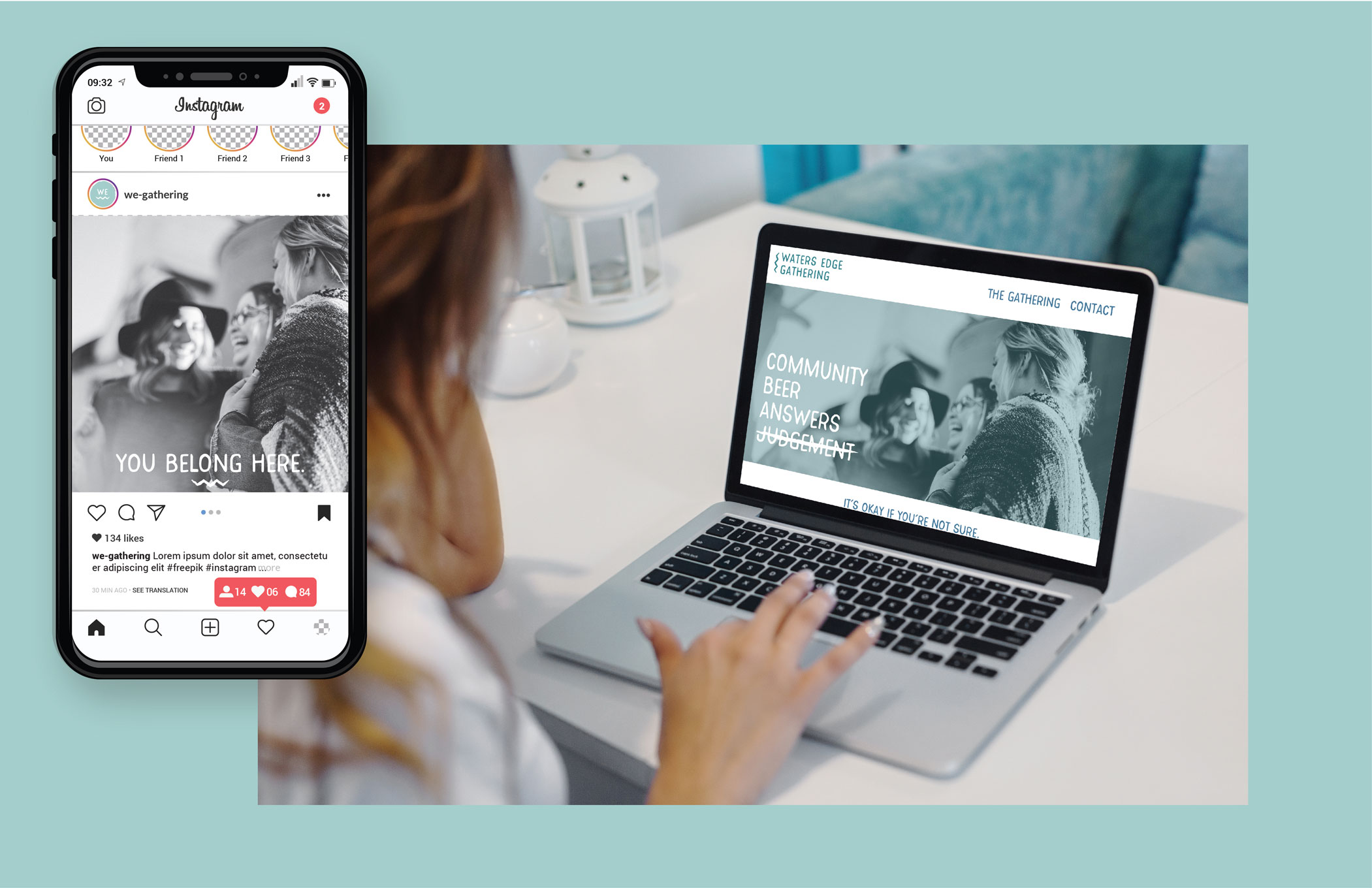
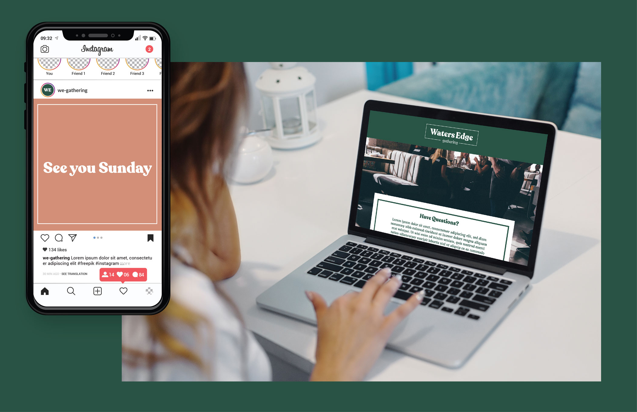
Water’s Edge wanted to emphasize that they were a place for younger generations to feel welcome, heard, and appreciated. We wanted their brand to speak to those audiences without seeming too trendy. We gathered some inspiration from social media content, focusing on contemporary color palettes paired with subtle typography, and clean, minimal marks.
Each mood board is an entirely different take on these concepts and presented the client with the chance to say: “that’s who we are.” They were able to choose the direction that not only resonated with their target audience, but themselves.
Concepts
From these mood boards, we developed four different logo + brand directions. Each concept was presented with its mood board and mockups to show the extent and potential of the brand.
Concept One
Concept one drew heavily from the idea of water. We thought about water as something loose, and undefined. Water is changeable and takes many forms, just as the way people understand and participate in religion changes over time. Water is also always moving forward and making progress. The palette is young, friendly, and welcoming.
Concept Two
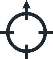
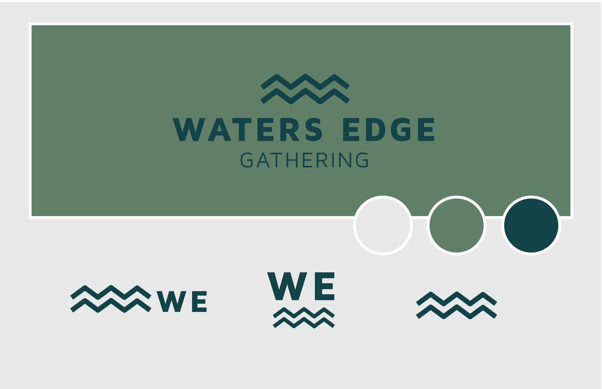
When we first met the client, they mentioned that they liked the simplicity of our Northbound logo. They wanted a simple mark that was modern and representative of their target demographic. We took that idea and looked into how we could make minimal work for a brand with such dense, important messaging. The icon, composed of two zig-zag lines, represents not only water, but also the journey people embark on through their relationship with religion and the ups and downs they experience. It also represents that no one has to take that journey together, hence the two parallel lines that do not diverge. Water’s Edge gives them a community and partners in their journeys.
Concept Three
Concept three ties Water’s Edge to the community. We wanted to create a concept that felt like West Michigan. The name reminds us of our relationship to water as Michiganders and our access to nature. We are lucky to grow up in a place that teaches us to respect nature and appreciate it. It’s also something that we can all relate to here; and therefore, is something that brings us together.
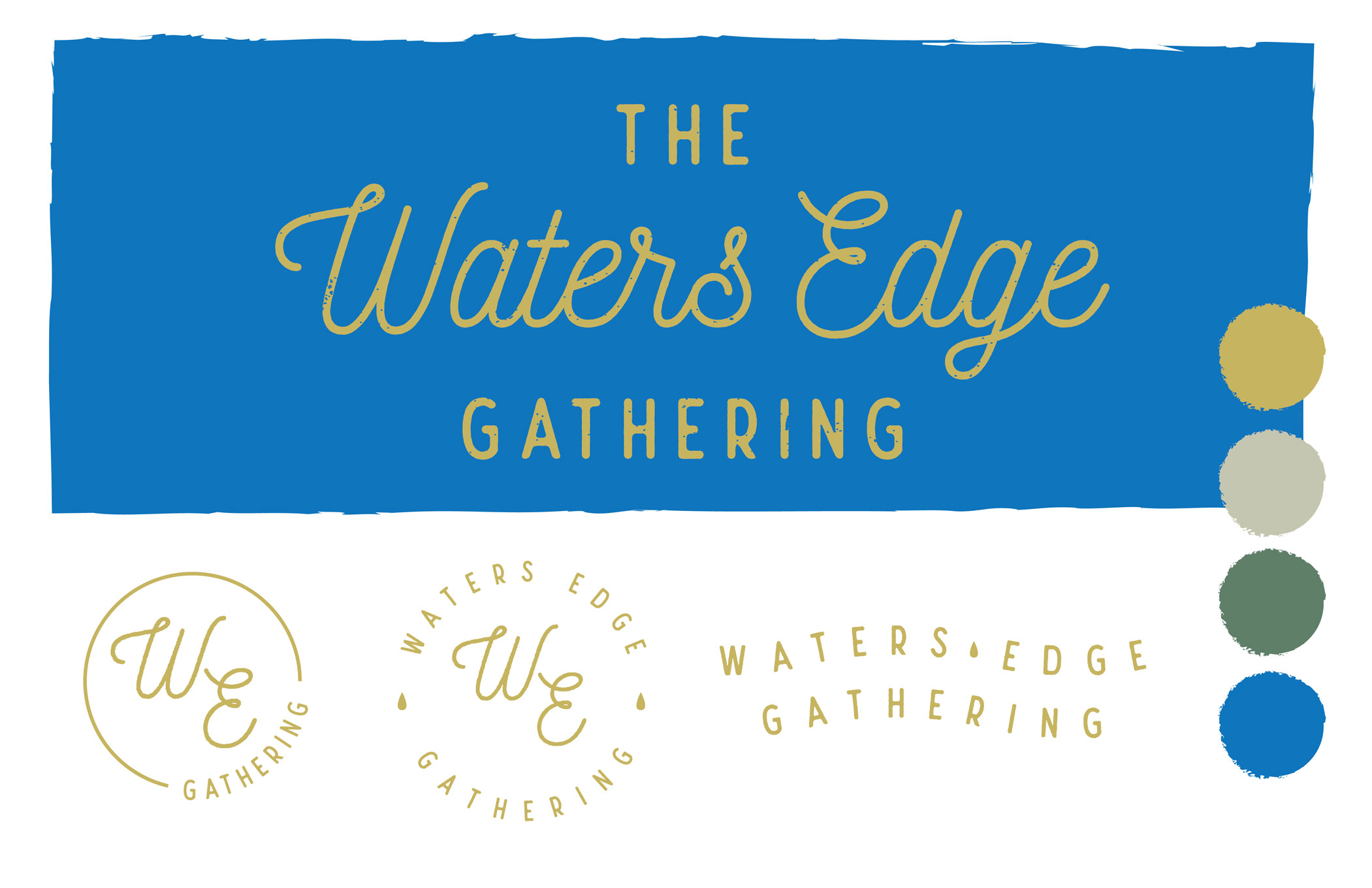
Concept Four
Concept four is somehow the most and the least 2019 of any of the concepts. As we are in a revival of bold and atypical serif fonts inspired by Cooper Black and its prevalence in the trendy 70s, we wanted to give a new favorite font of ours a shot. Recoletta Black is familiar and also just a bit different. The colors follow suit, a traditional green placed in an unexpected palette. The pink is a tribute to the (maybe too) bright Color of the Year, Living Coral. Essentially each piece of this brand was picked for its timeliness — and somehow, we ended up with a timeless mark.
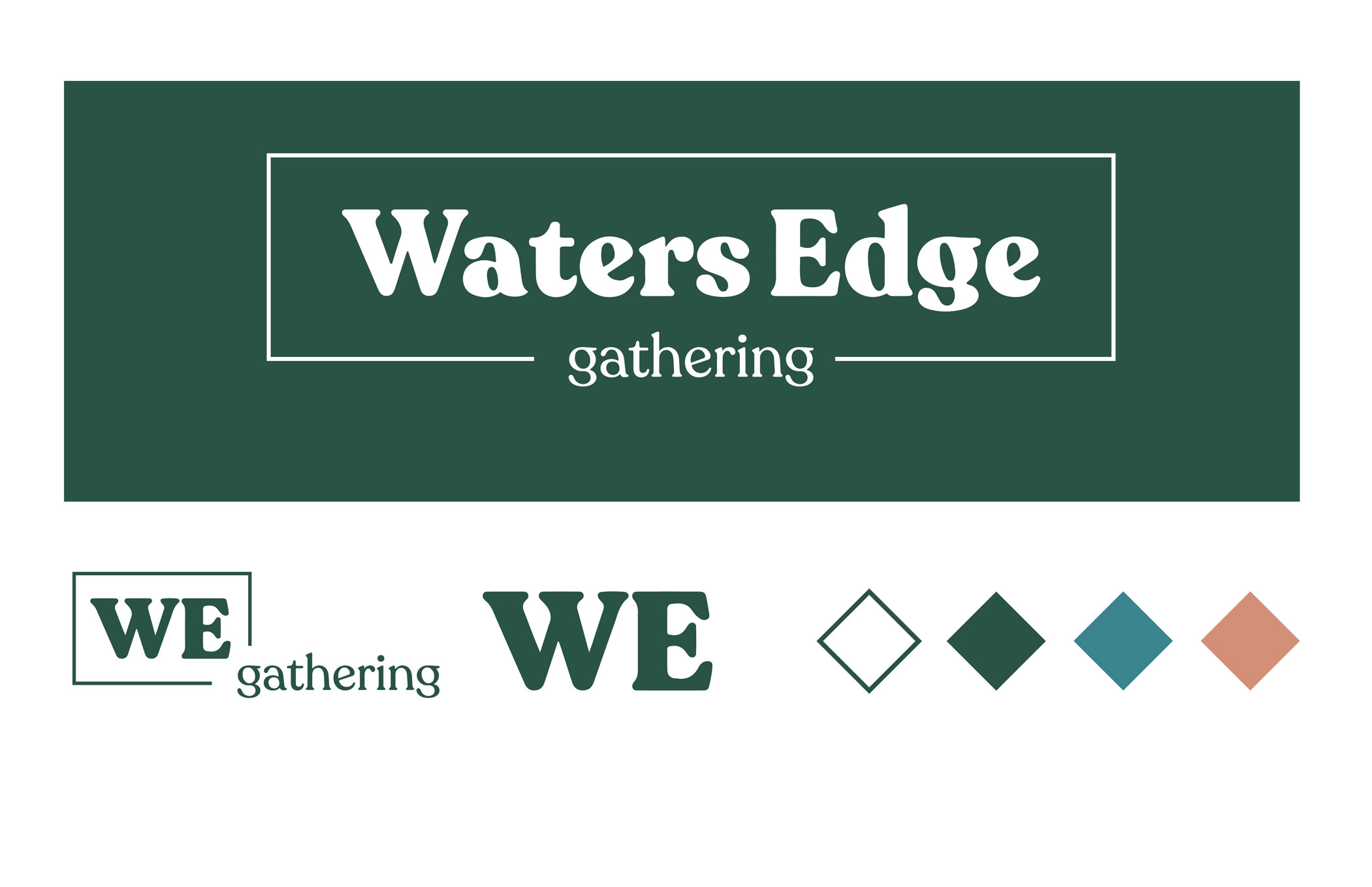
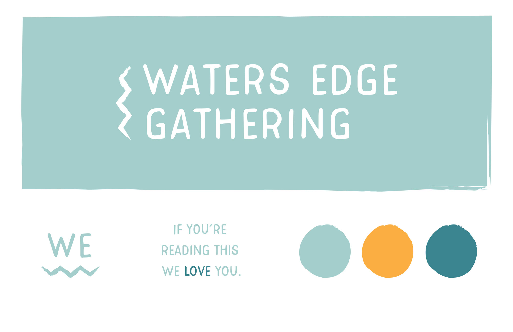
The Final Brand
Out of these very different concepts, the client chose to go with Concept two. The minimal aesthetic that they originally requested won out in the end and we think it’s a great fit. We can’t wait to see how they use their brand in the future.
Color
The main brand color is Lake. It is a deep blue-green. This color is appealing and unique. While blue is a commonly used tone, Lake is a less-common variation that still retains the trust, transparency, and strength that blue often carries. The accent color is Forest. It is a dull, desaturated olive green. This color adds neutrality and earthiness to the pallet and serves as a solid foundation. The second accent color is Slate. It is a pale grey. This color adds a seriousness to the palette, as well as visual interest when used in place of white.
Lake
#114347
Forest
#617f68
Slate
#e6e7e8
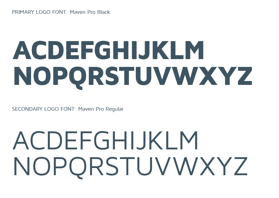
Typography
We chose Maven Pro because it’s minimal and clean, but also slightly different. It’s humanist, friendly letterforms add a softness to an otherwise very serious brand.