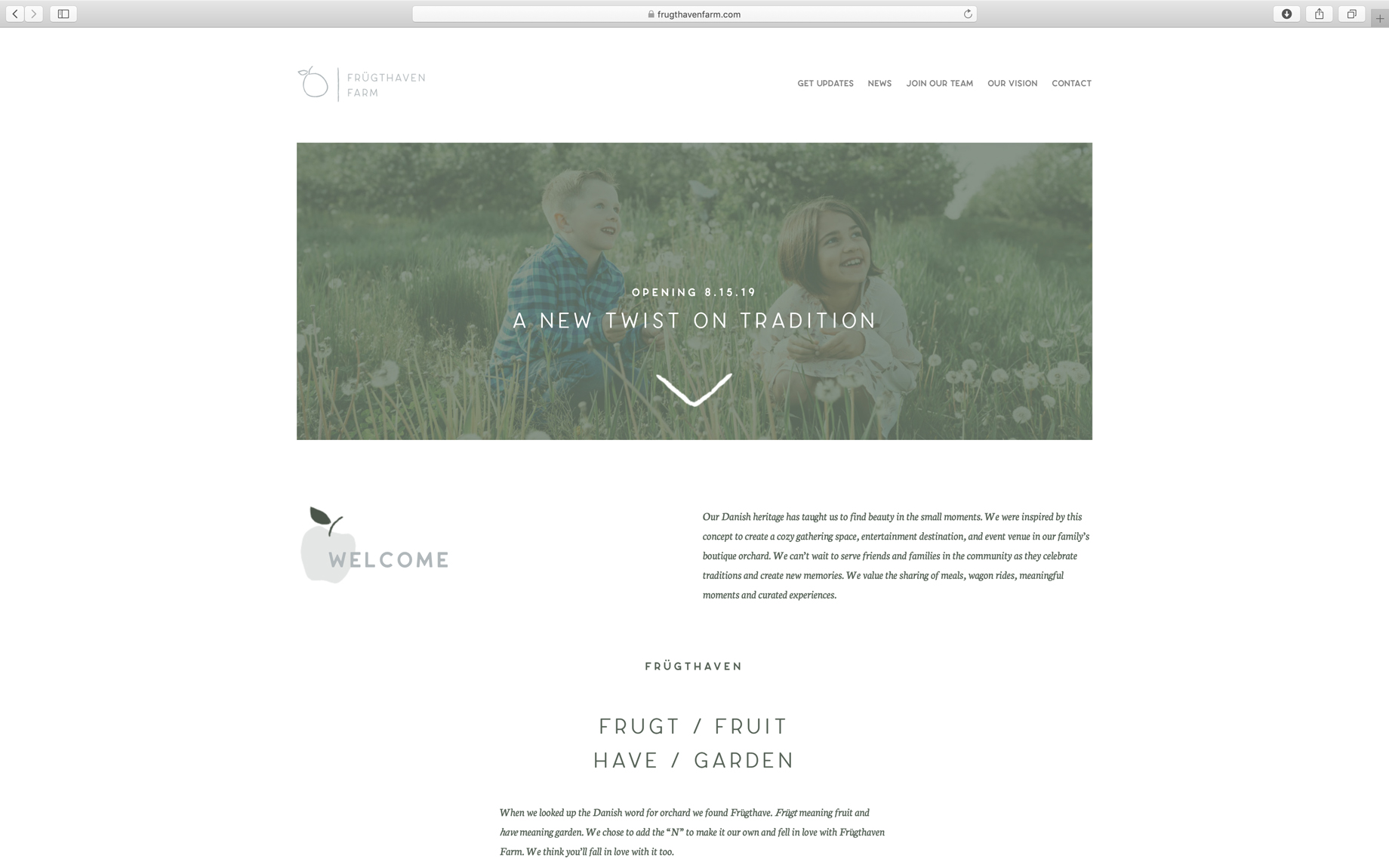
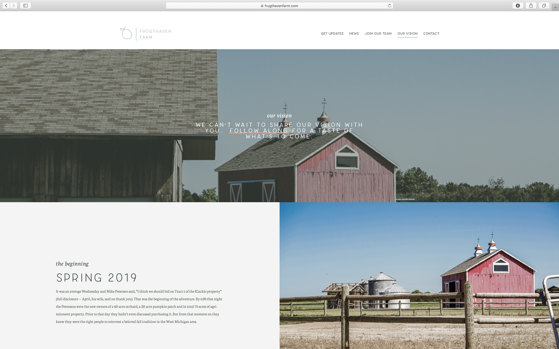
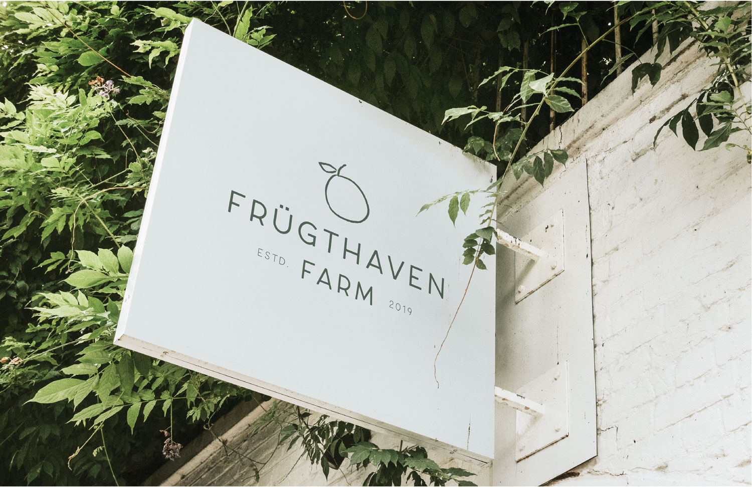
If you’re from West Michigan, you’ve at least heard of the orchard in Greenville. More likely, you’ve spent that first crisp, sunny day of fall traipsing through the pumpkin patch, eating apple cider donuts, or bumping along on a wagon ride through the rows of apple trees, making memories with your family. That’s why, when the old Klackle’s property went up for auction, a local Greenville couple was inspired to purchase it with every intention of preserving a great West Michigan Tradition — albeit, with a twist.
Frügthaven Farm
Frügthaven Farm
If you’re from West Michigan, you’ve at least heard of the orchard in Greenville. More likely, you’ve spent that first crisp, sunny day of fall traipsing through the pumpkin patch, eating apple cider donuts, or bumping along on a wagon ride through the rows of apple trees, making memories with your family. That’s why, when the old Klackle’s property went up for auction, a local Greenville couple was inspired to purchase it with every intention of preserving a great West Michigan Tradition — albeit, with a twist.
Frügthaven Farm
If you’re from West Michigan, you’ve at least heard of the orchard in Greenville. More likely, you’ve spent that first crisp, sunny day of fall traipsing through the pumpkin patch, eating apple cider donuts, or bumping along on a wagon ride through the rows of apple trees, making memories with your family. That’s why, when the old Klackle’s property went up for auction, a local Greenville couple was inspired to purchase it with every intention of preserving a great West Michigan Tradition — albeit, with a twist.
Deliverables
Brand Strategy
Brand Identity + Messaging
Logo Design
Social Media Consulting
Initial Website Design + Development
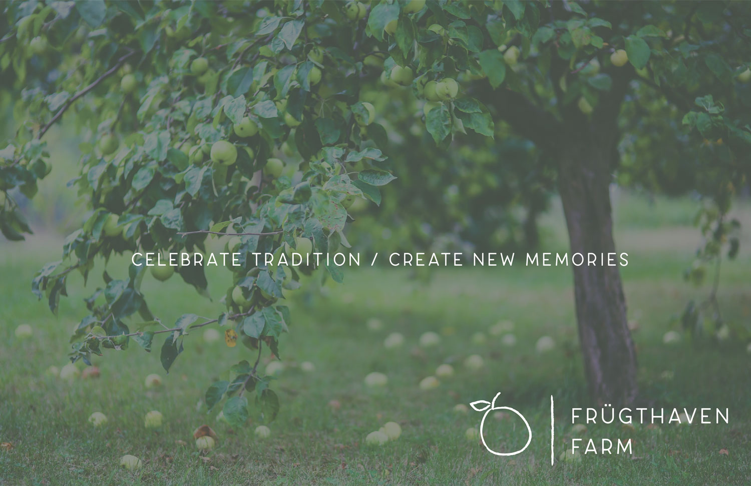
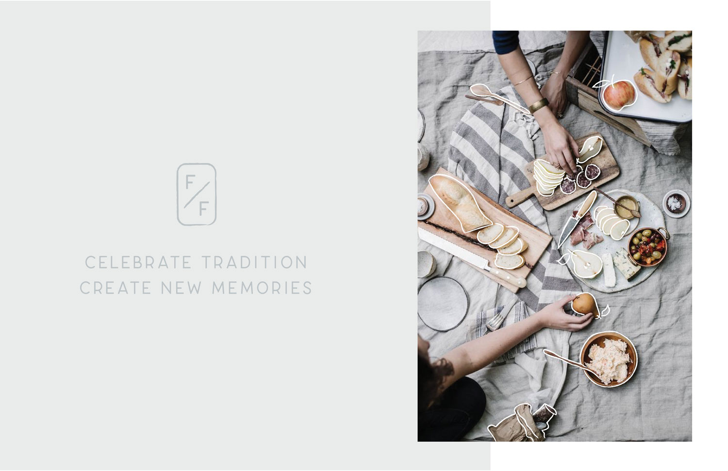
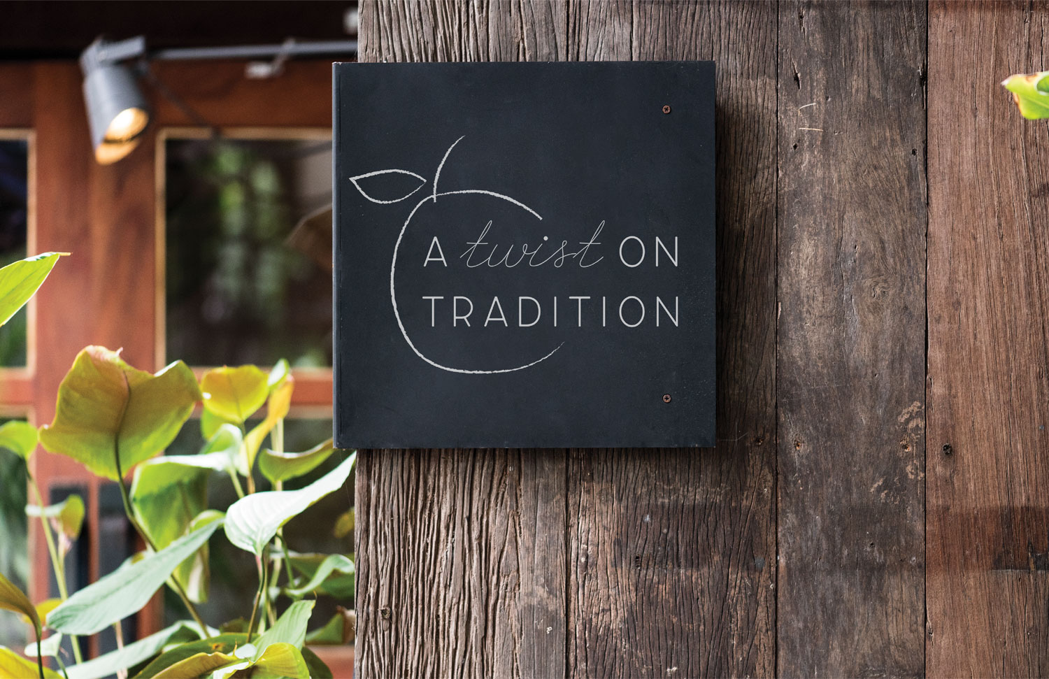
A twist on tradition.
“Our Danish heritage has taught us to find beauty in the small moments. We were inspired by this concept to create a cozy gathering space, entertainment destination, and event venue in our family’s boutique orchard. We can’t wait to serve friends and families in the community as they celebrate traditions and create new memories. We value the sharing of meals, wagon rides, meaningful moments and curated experiences.”

Branding Process
Mood Boards + Concepts
Hygge: “a quality of coziness and comfortable conviviality that engenders a feeling of contentment or well-being (regarded as a defining characteristic of Danish culture).”
Take a look at our process for branding Frügthaven Farm. We are very proud of the final brand we were able to deliver for what is soon to be a new tradition for West Michigan families.
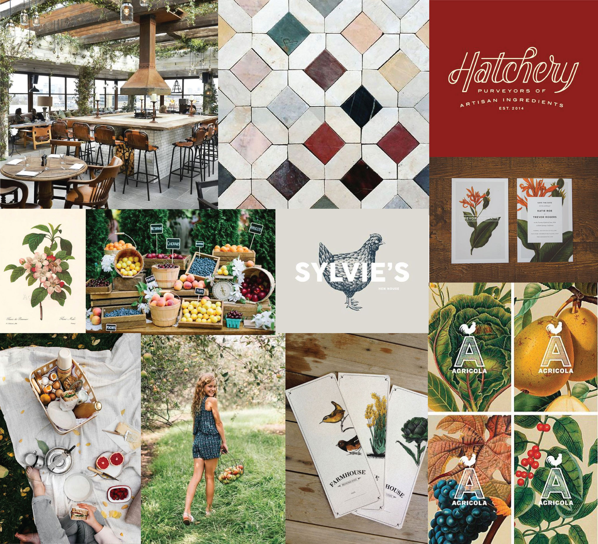
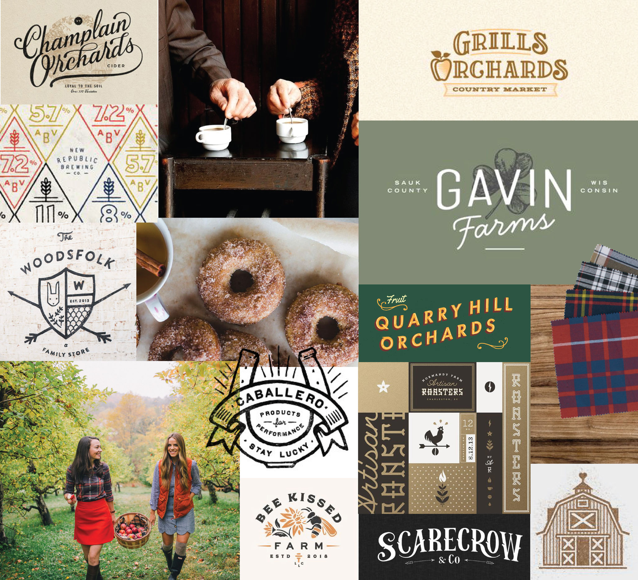
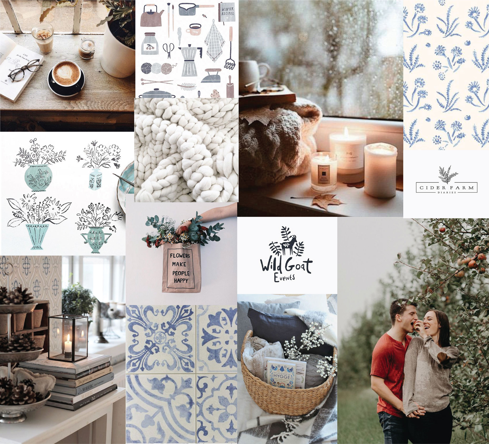
Mood Boards
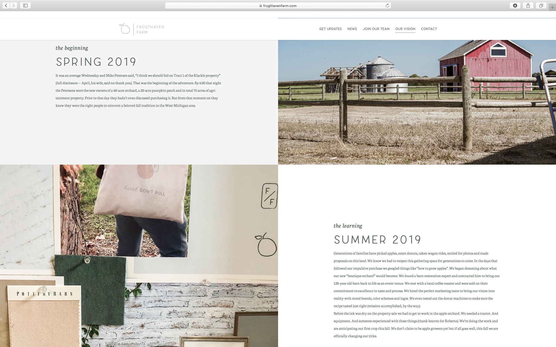
When we first approached the Frügthaven Farm brand, we came up with some adjectives with the clients describing what their vision for the farm was. We also added in what we believed their guests would be looking for from them. There was a lot of buzz in the community over what was going to happen to the beloved orchard. People mourned the loss of a community staple, and feared that there would no longer be any orchard. We had to not only reassure them that the new ownership had every intention of preserving the best parts of Klackle’s, but also gently welcome them to the new parts.
Frügthaven is different than the old orchard — but the community is also different than what it used to be. There is more demand for upscale family activities as well as a respect for tradition and heritage.
We continuously walked this line between new and old, modern and traditional, upscale and inviting. Finally, we landed on the list of adjectives and created some mood boards that translated those words into visuals.
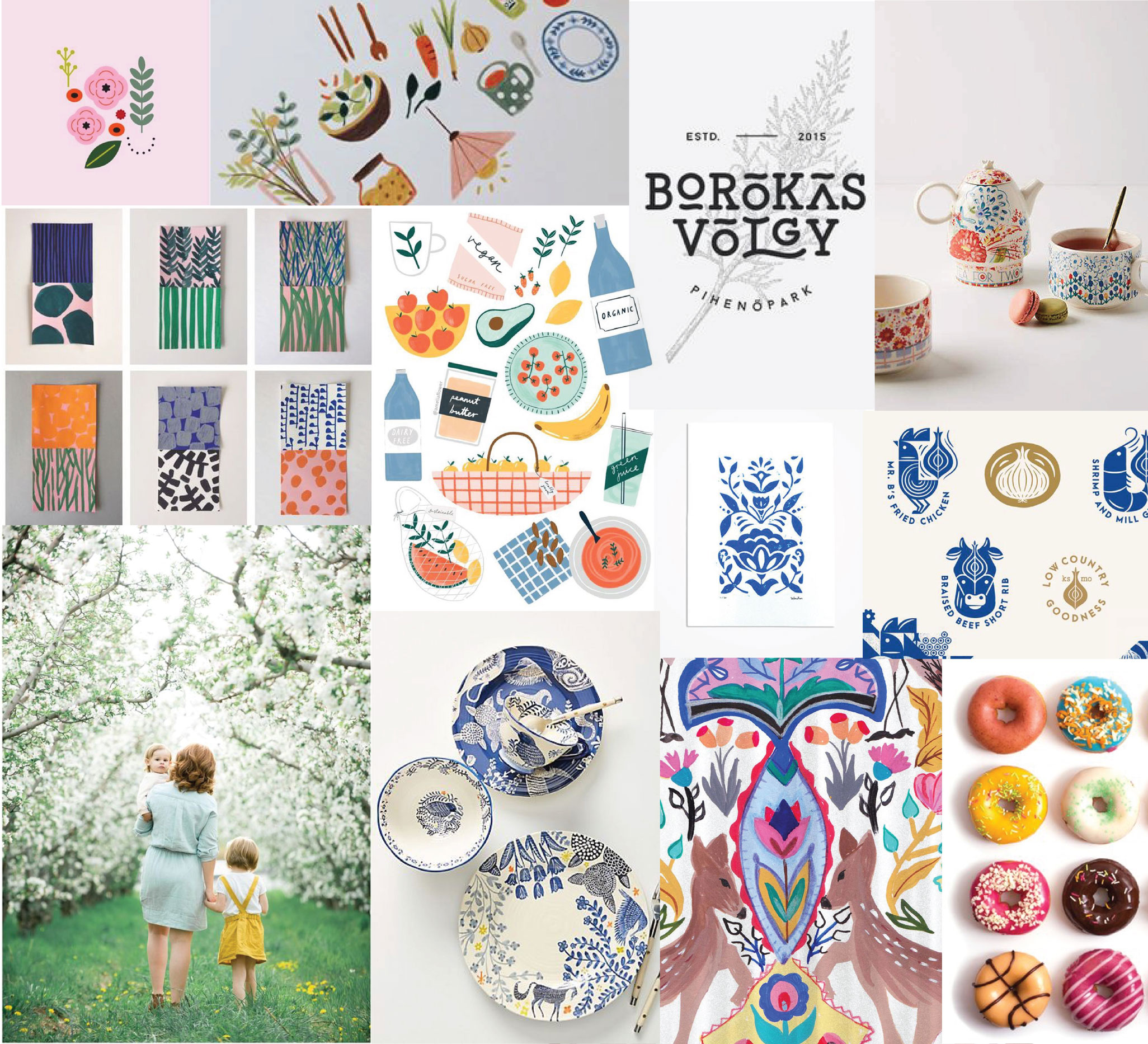
Concepts
Our clients and our team agreed on the direction shown in the final mood board above, which best captures both the heritage and tradition of Greenville, as well as the new, upscale environment Frügthaven will offer.
We began concepting from there, and after much deliberation, decided on the brand direction. Because Frügthaven will grow into so much more than just the orchard (wedding venue, tavern/cidery, coffee house, market, etc.) this brand had to be exceptionally flexible.
The Final Brand
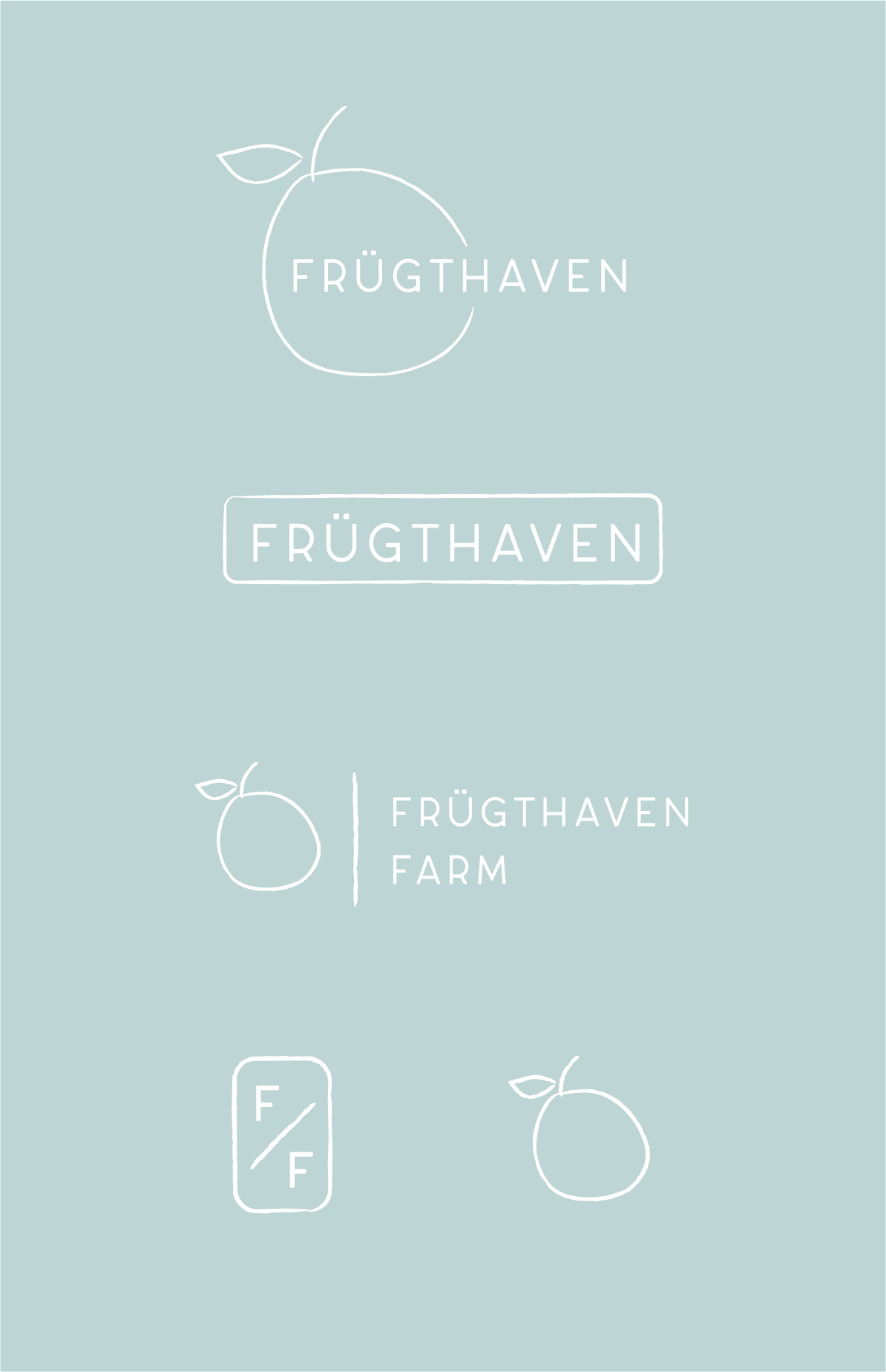
Our final direction was inspired by Danish lifestyle and focus on simplicity. It honors the history of the farm by using the hand-drawn apple form, while appearing fresh and modern. We paired this sketch-style icon with the Scandinavian style typeface.
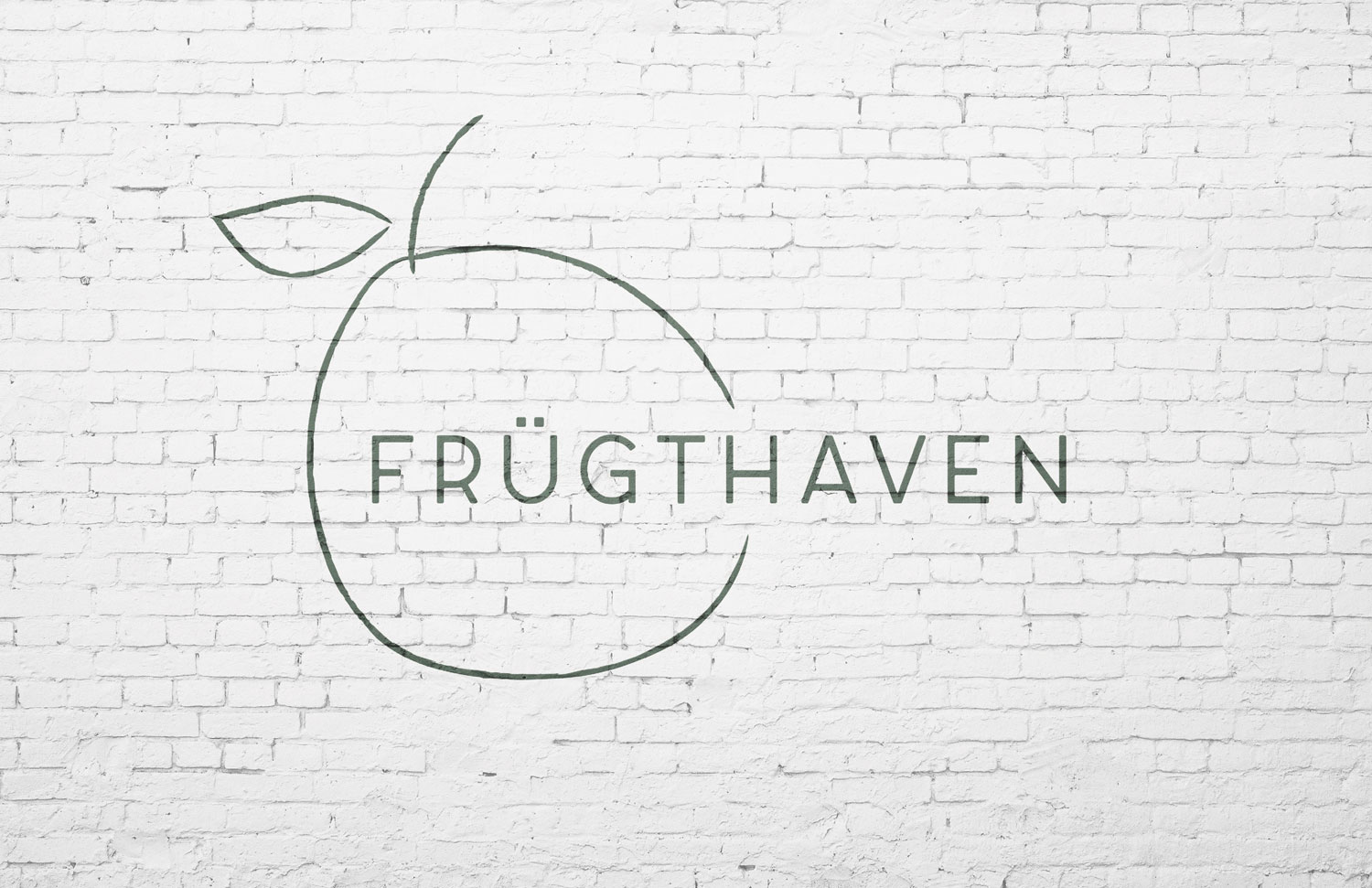
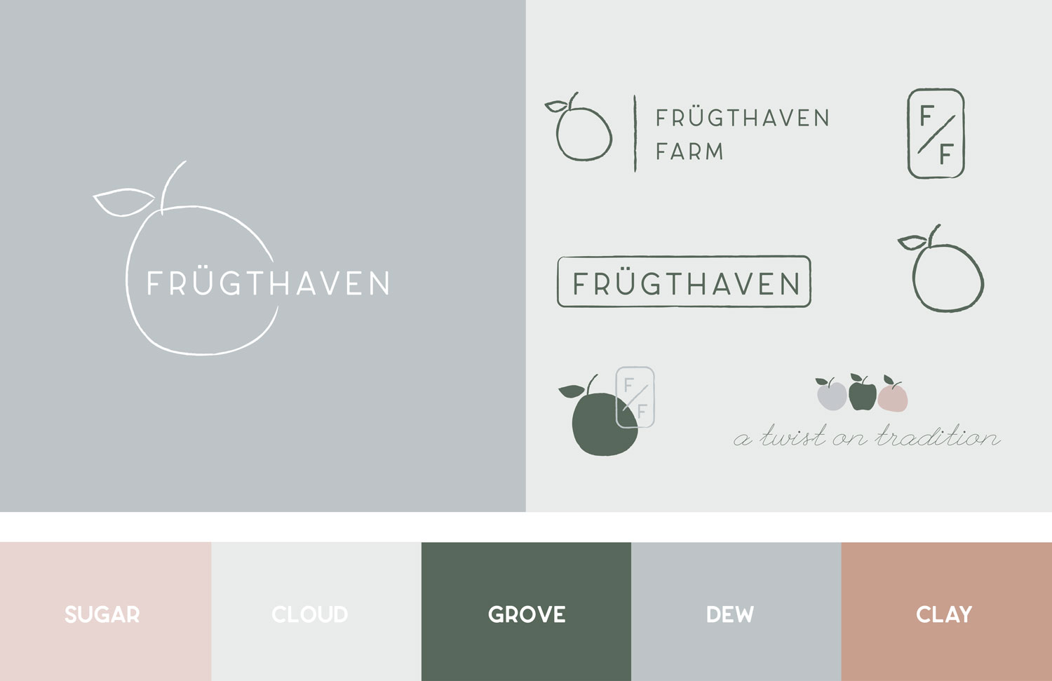
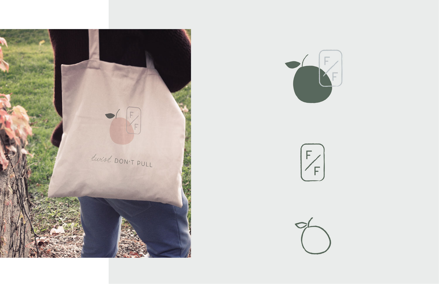
The Logos
We created a family of logos that could be used in a variety of applications. There would be everything from large-scale signage, to packaging, to menus, to merchandise that would all need to use the identity in some way. These logos are wide-ranging enough to accommodate those needs, yet united in the brand aesthetic.
Color
The main brand color is “Dew.” It’s a pale grey-blue. This color was directly inspired from collected “Hygge” interior photos, illustrations, and guides. It’s a serene, welcoming tone that can be used as both a brand color and a neutral. We wanted to stay away from the typical farm/orchard red for the main brand because it felt too aggressive and bold. Instead of red, we use “Clay,” which helps indicate that the slightly abstracted apple illustrations are, in fact, apples. “Clay” is used along with the other accent colors shown in this palette to continue to create a warm, inviting feeling.
Sugar
#e8d5d1
Cloud
#114347
Grove
#58685b
Dew
#bdc4c7
Clay
#c89f8e
Canvas
#dcd5ce
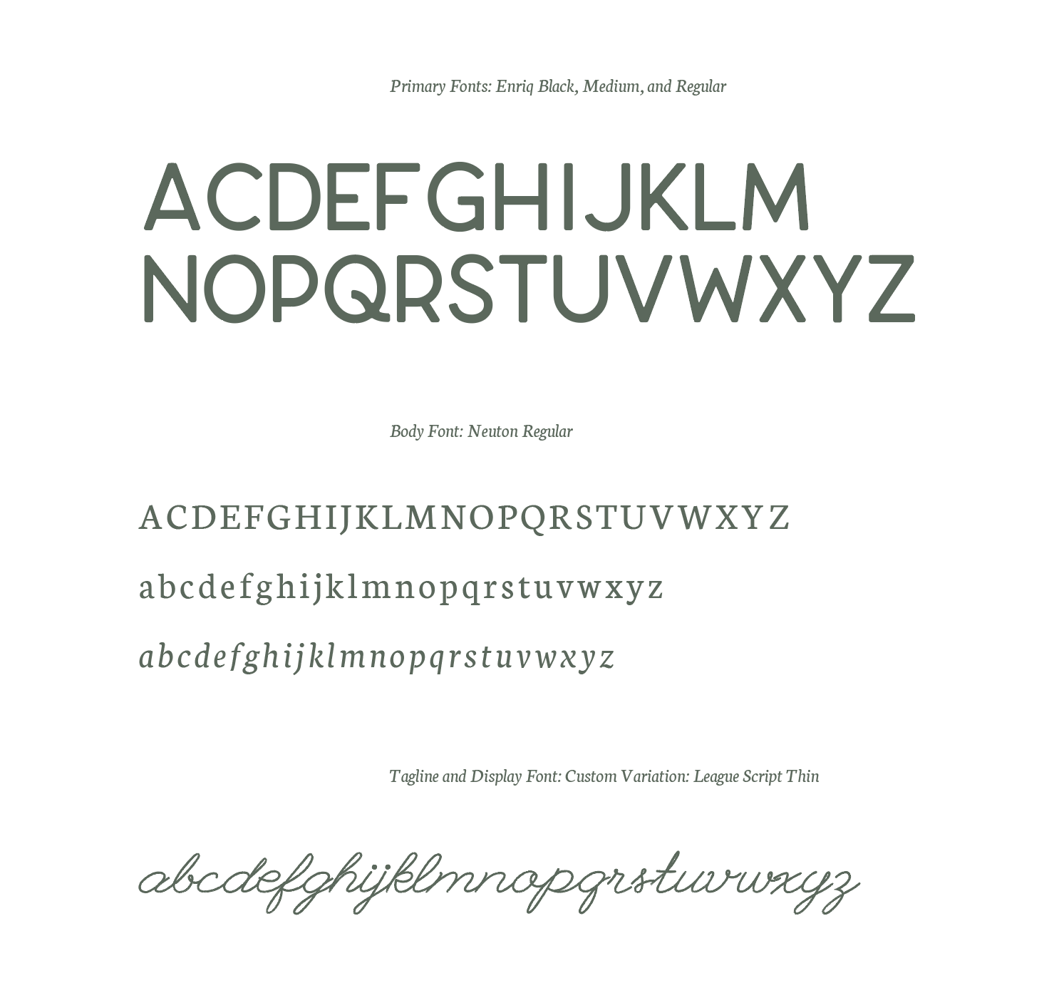
Typography
We chose Enriq as the brand typeface due to its Scandinavian inspired design. It’s minimal, but still has a softness to it that feels welcoming. It nicely contrasts the hand-drawn apple, and matches it for weight. Elsewhere, we use a custom variation of League Script — a fun, clean script typeface that adds a dash of playfulness to an otherwise somber brand. We hand-drew this variation using the same method as we used for the other illustrations and icons.
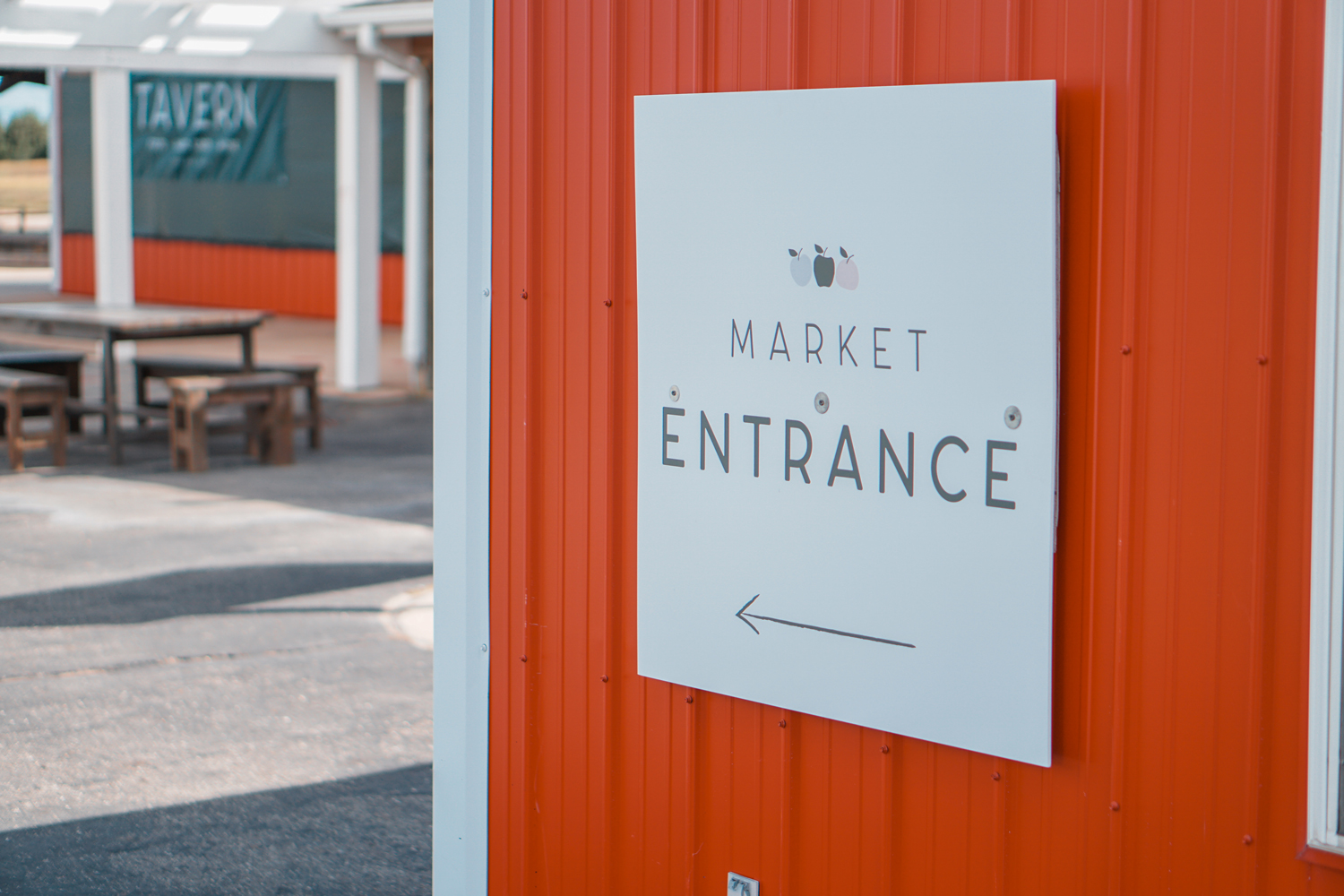
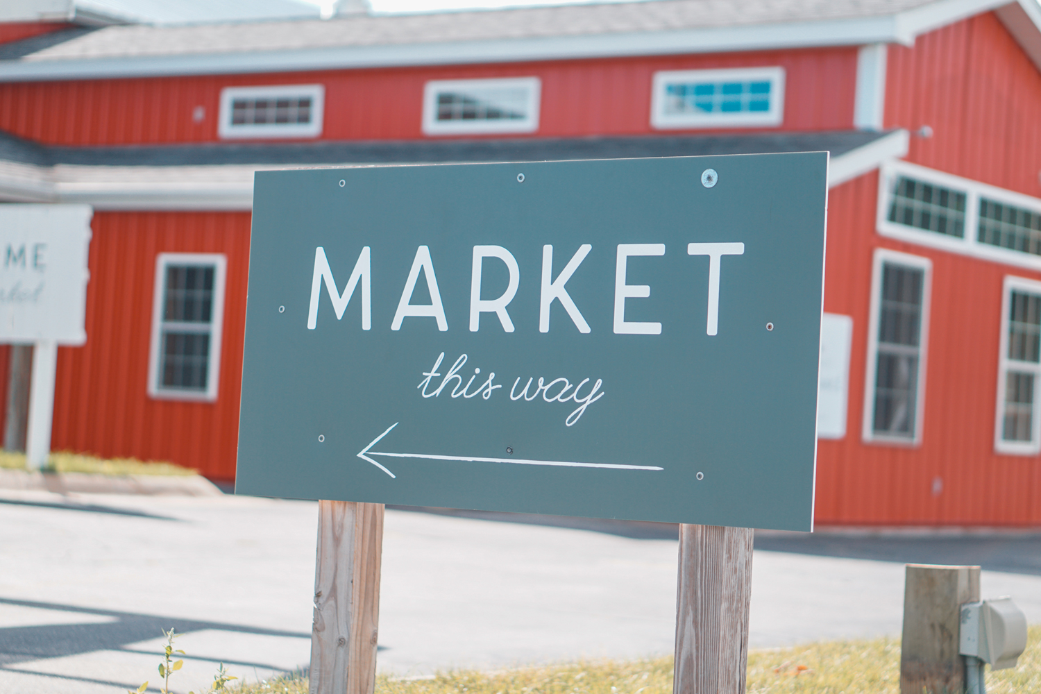
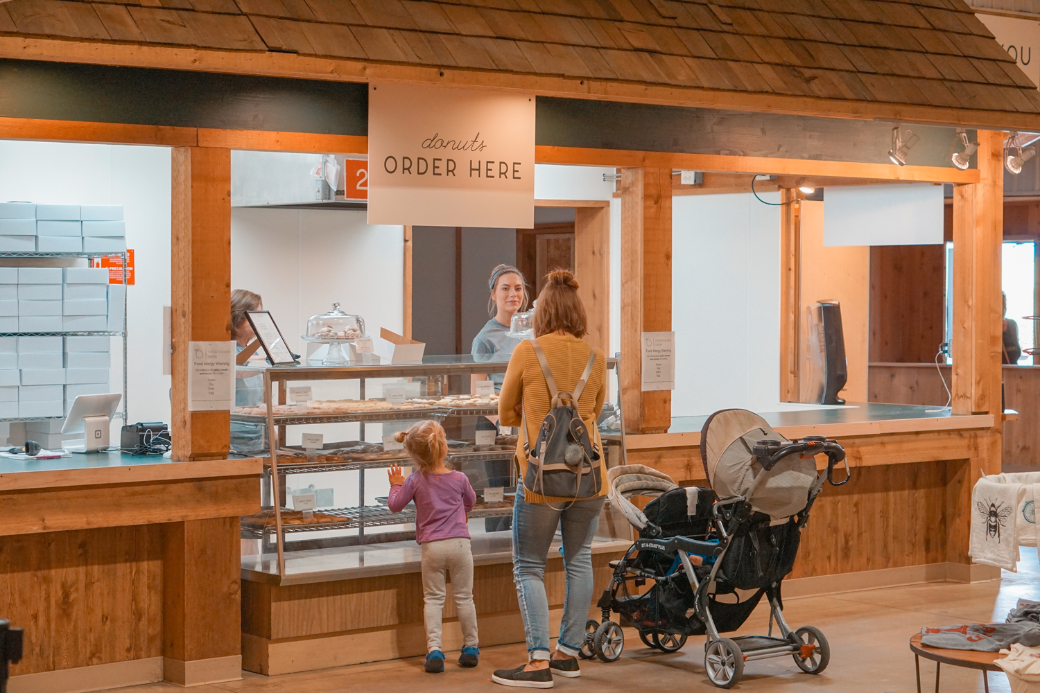
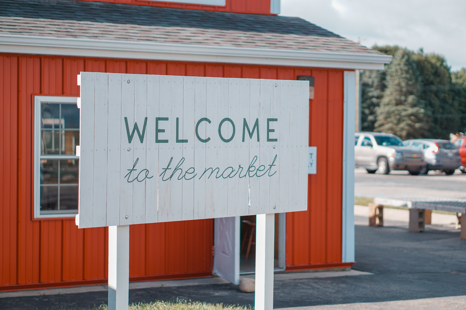
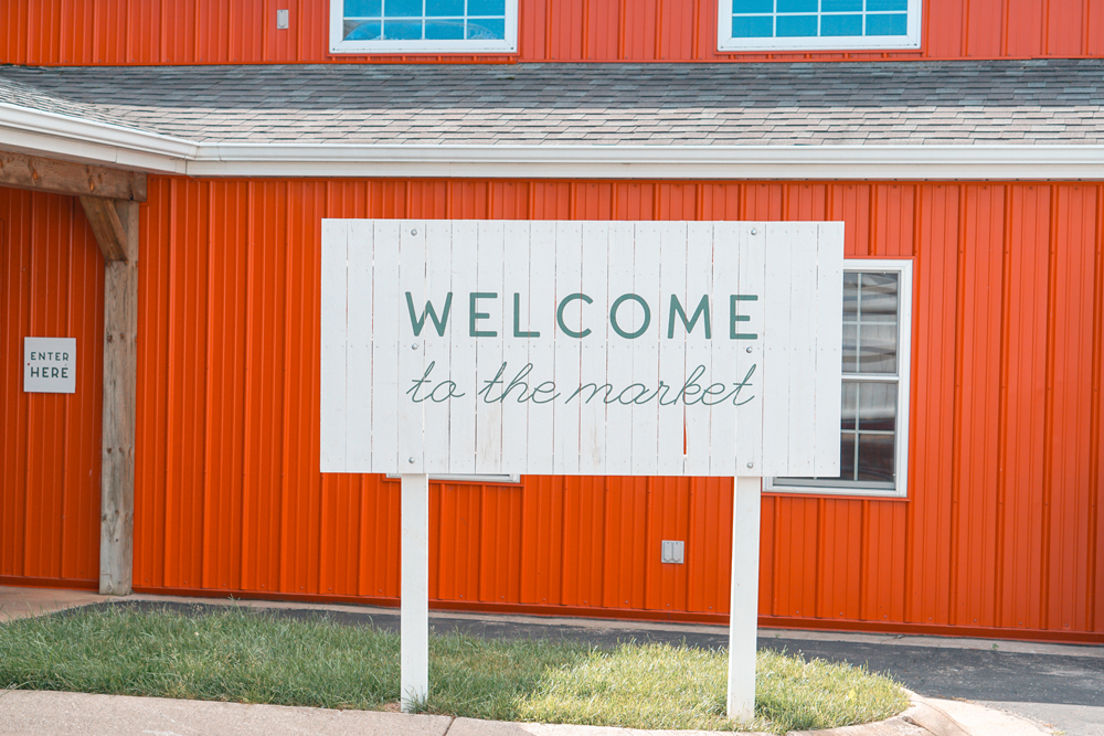
Signage
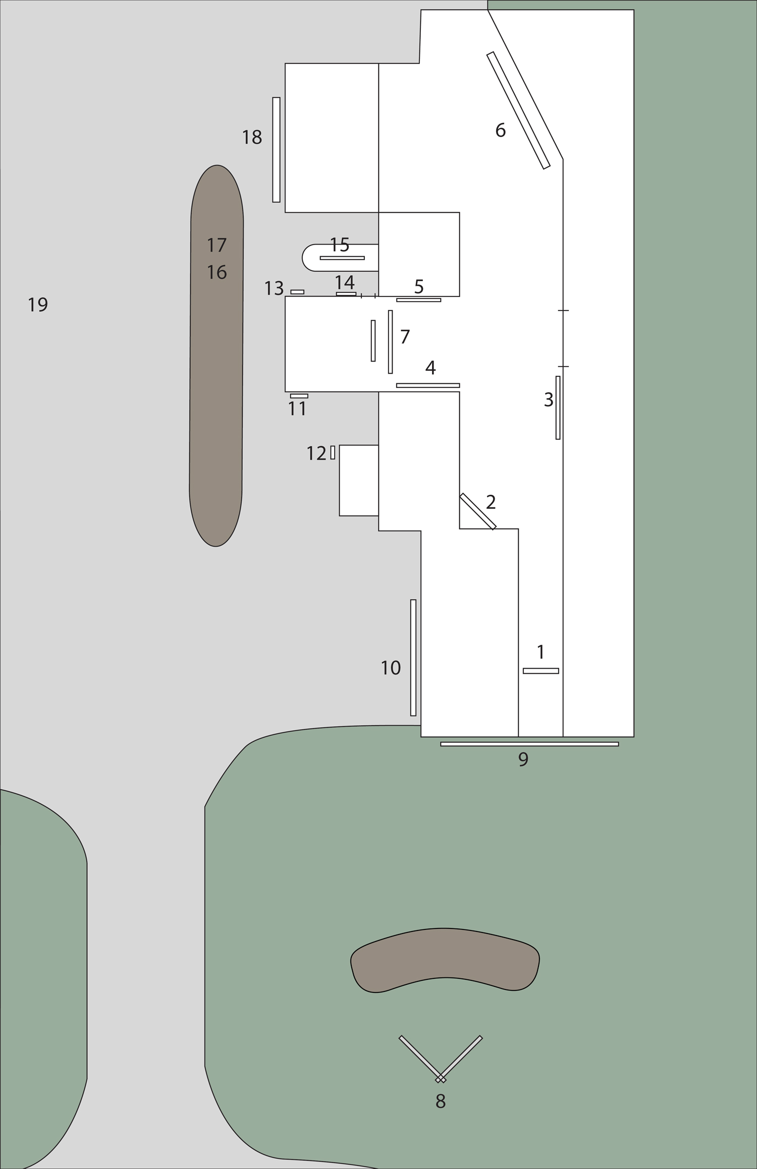
When Frügthaven opened this August, it had already changed a lot, but with more changes coming, they needed a temporary signage solution to get them through this fall. People who had been visiting for years would not find the entrance, donuts, or checkout in the same places they had been. We helped create a wayfinding solution throughout the property using the brand we established for them.
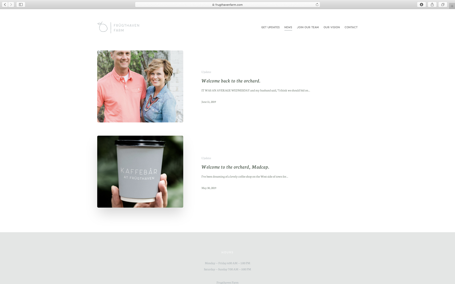
Initial Website Design
Frügthaven wanted a simple website to help their visitors learn about their process, host a blog, and hire new employees.