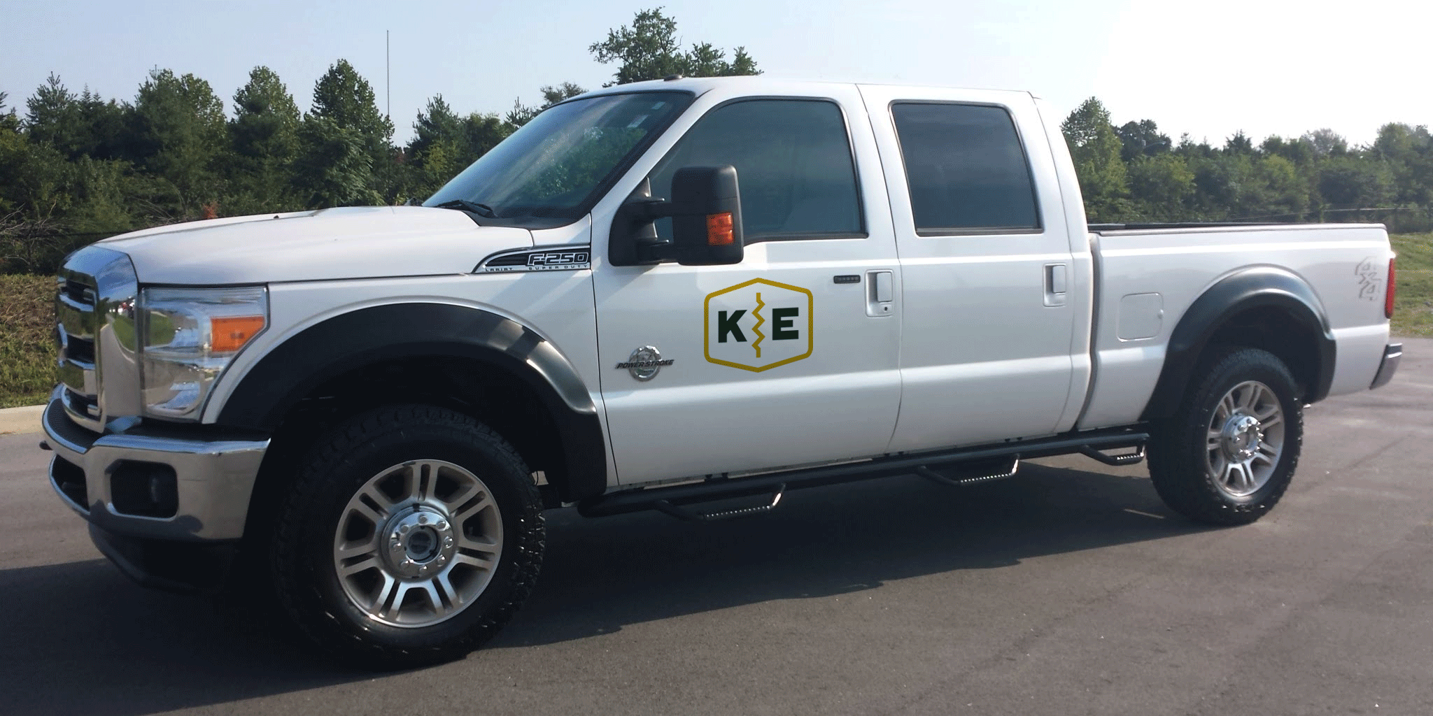
The Kotman Electric brand that we developed is one that showcases the professionalism of their electrical work while maintaining the friendly, approachable nature of their people.

Kotman Electric

Kotman Electric
The Kotman Electric brand that we developed is one that showcases the professionalism of their electrical work while maintaining the friendly, approachable nature of their people.
Kotman Electric
The Kotman Electric brand that we developed is one that showcases the professionalism of their electrical work while maintaining the friendly, approachable nature of their people.
Client
Kotman Electric
Year
2018
Deliverables
Brand Identity
Logo Design
Friendly & Professional Electrical Work
We were asked to create an identity for the Kotman Electric brand that was relatable yet unique. With a large field of competitors in the West Michigan area, electricians and the work they do are familiar by default. The challenge was to develop an identity that showcased Kotman Electric’s friendly and professional electrician services.

Brand
New Brand Identity
It was important that the Kotman Electric brand showcased their friendly and professional attitude. Everything from the colors used to the typeface was chosen to relay this message.
Logo Mark
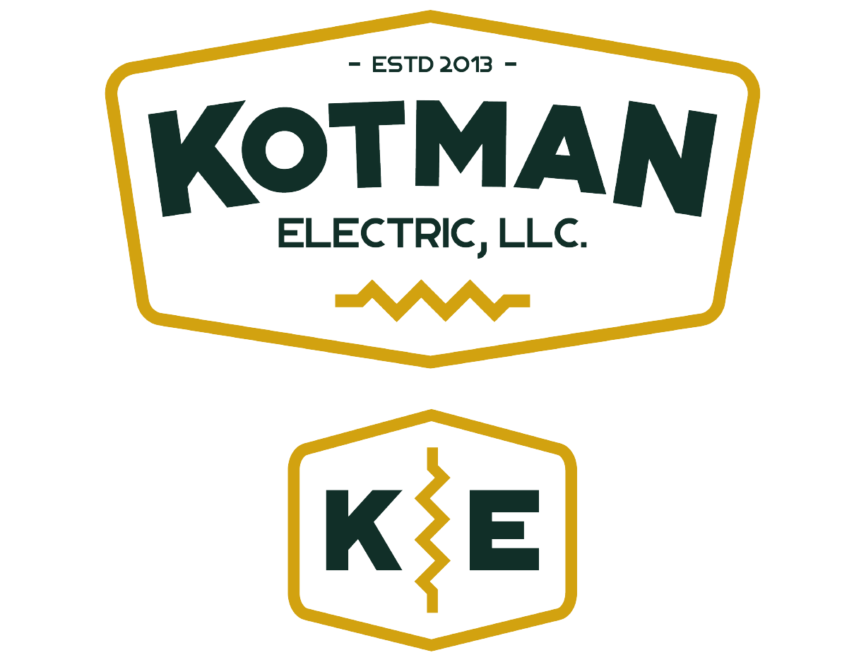
In electrical work, symbols are often used in blueprints to communicate layout. The resistor symbol is used to provide the given value of resistance to the passage of electric current, and we thought it was a great way to showcase Kotman Electric’s vast knowledge and expertise. The logo prominently displays the resistor symbol.

Color
The chosen primary color system — Spruce and Current — work in unison with the other brand elements to show off Kotman Electric’s welcoming identity.
Spruce
#112f28
Current
#d1a20c
Typography
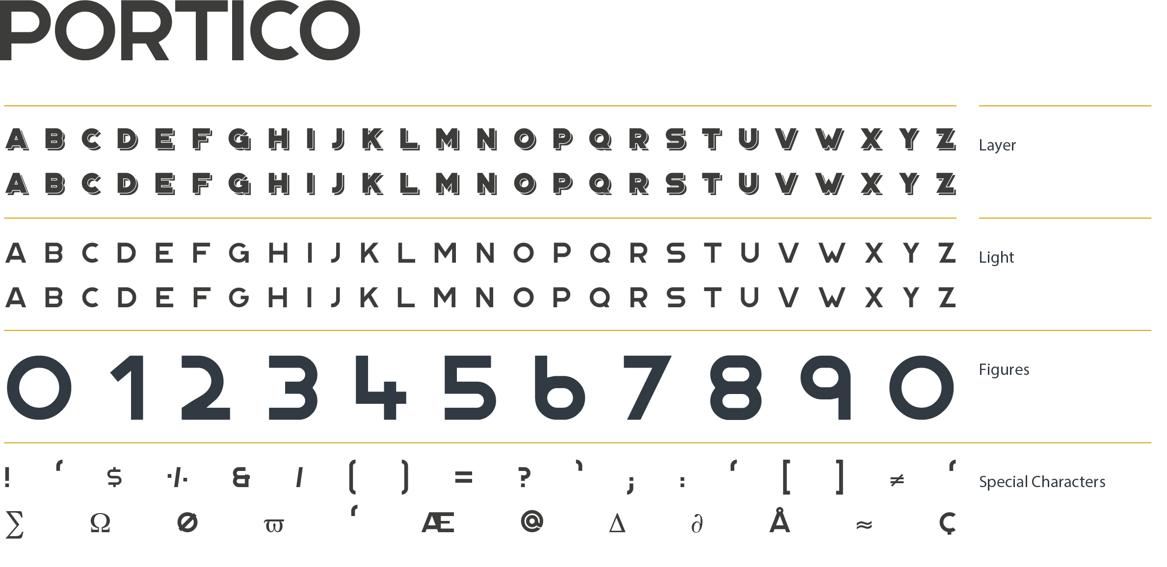
We chose Portico as the primary font family because it effectively communicates the Kotman Electric’s brand of professional electrical work.


